
— Heuristic Evaluation
— UI Research
— Task Analysis
— Prototype
Current State

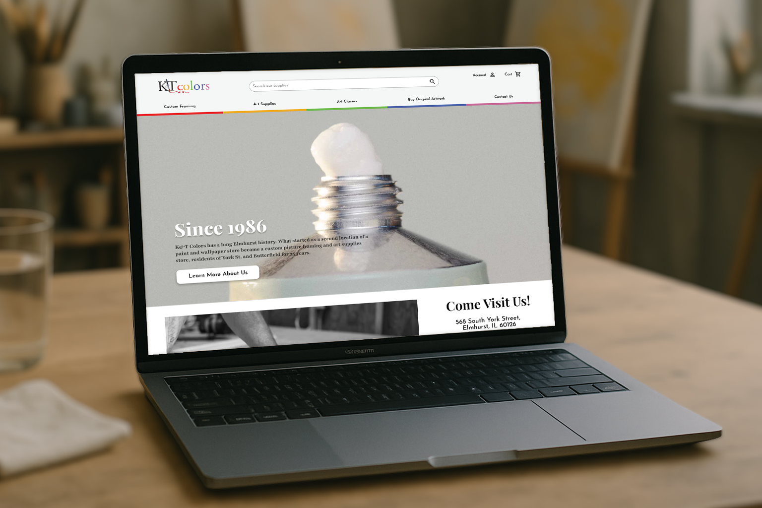
Overview
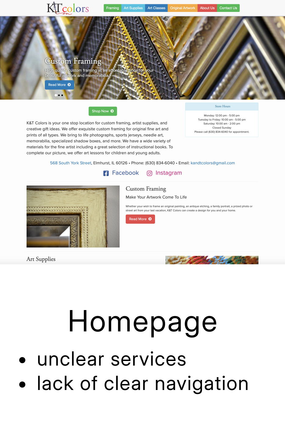
Other than it being impossible to checkout, the current flow from the homepage to the shopping cart pages lacks key information to help users feel confident in the products they are looking for or buying. How might we keep the local charm of the site while improving the user experience?
Aproach
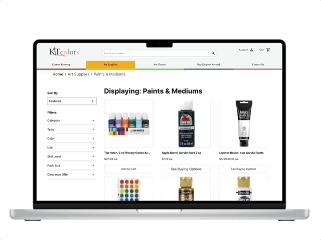
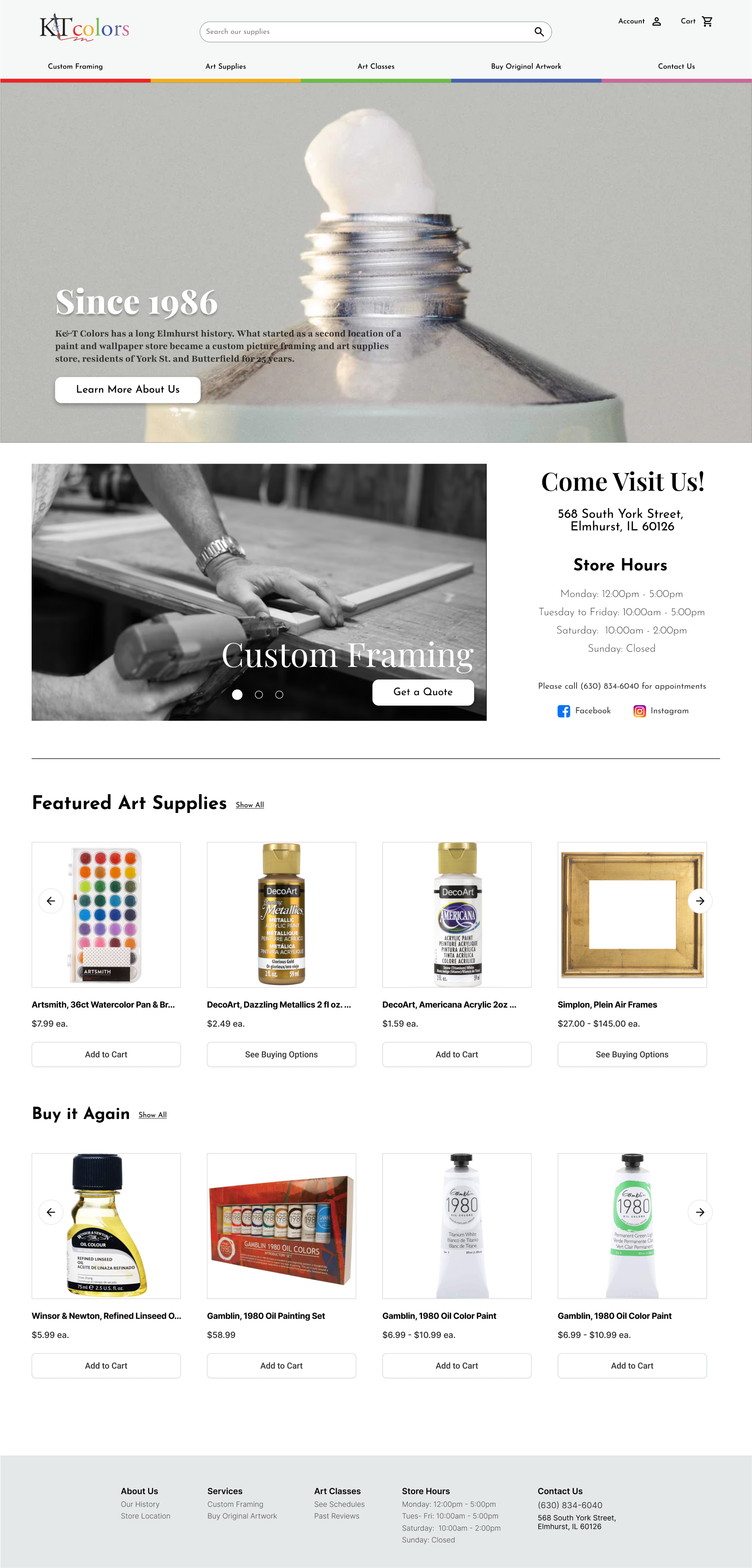
We kept the store’s original color palette and layout, while modernizing the visual identity with intuitive navigation, high-quality product images, and engaging descriptions. The result was a more functional, user-friendly site that still felt true to its local feel.
Final Wireframes
Research + Ideation
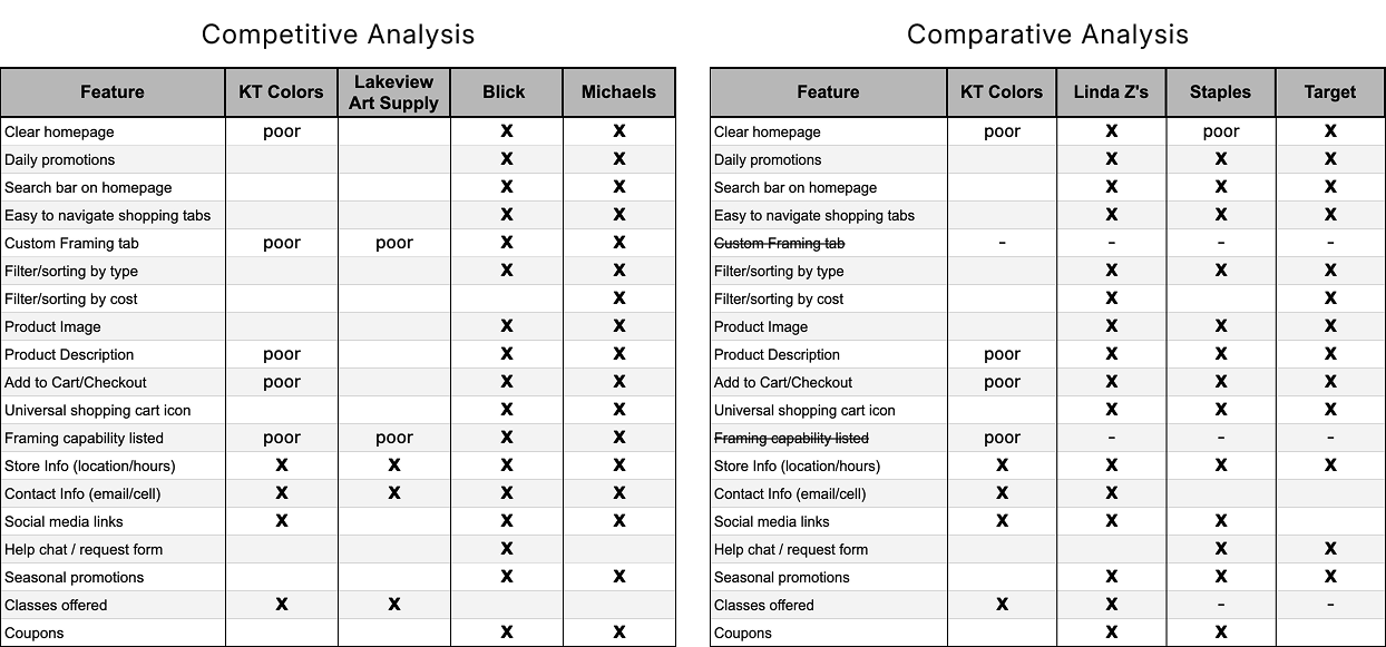
Learning the Market / Competitive and Comparative Analysis
Understanding Users / Heuristic Evaluation
After a heuristic evaluation, the most critical violations were in error management, memorability, and efficiency, as users struggled to complete their shopping experience. As a local small business, issues with learnability and satisfaction were less impactful.
Error Management
- Checkout process fails after payment
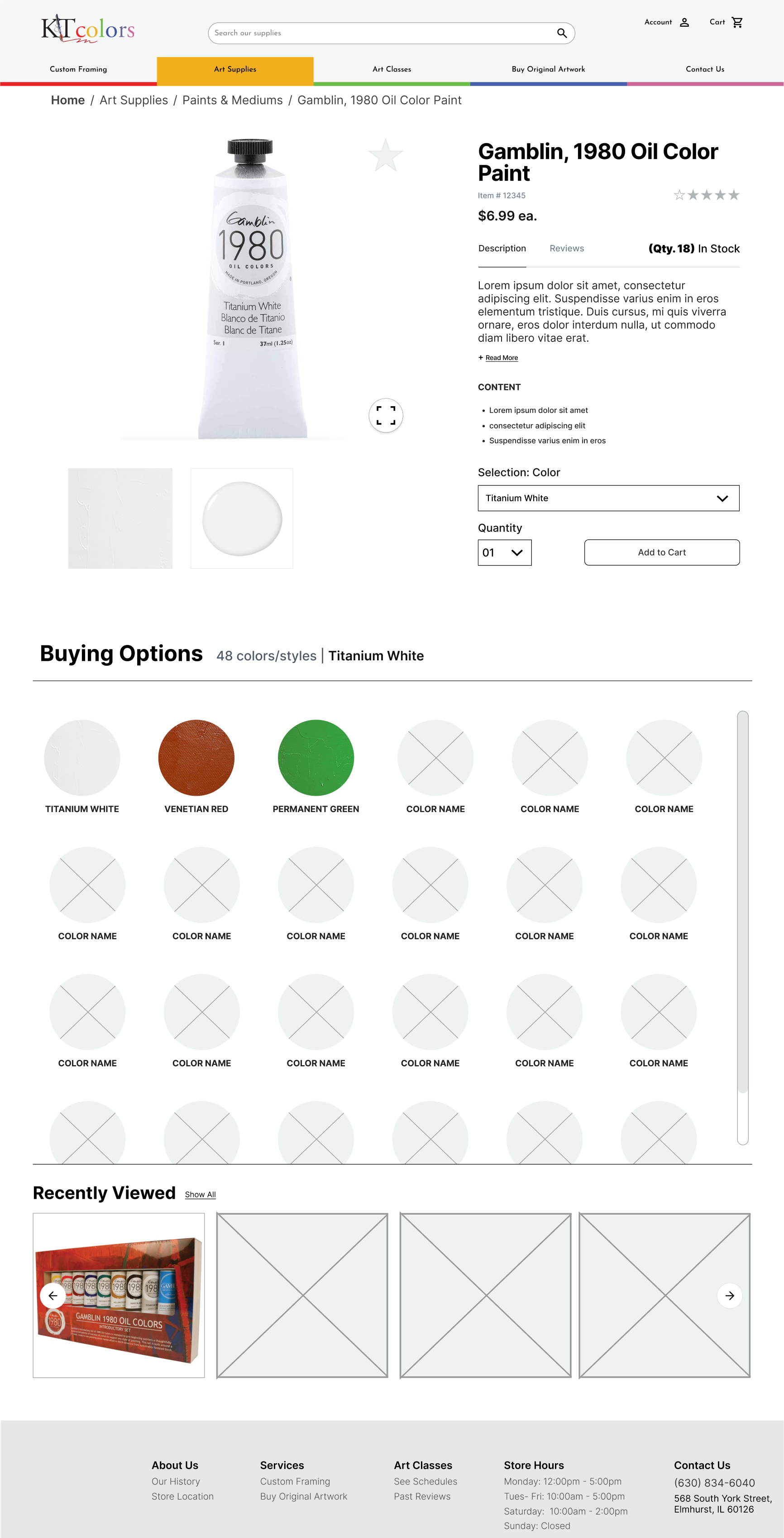
- Item dropdowns have multiples of the same selection options
Memorability
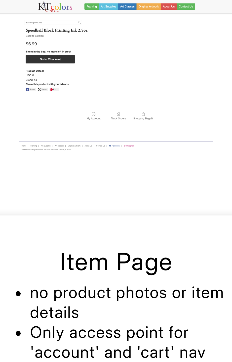
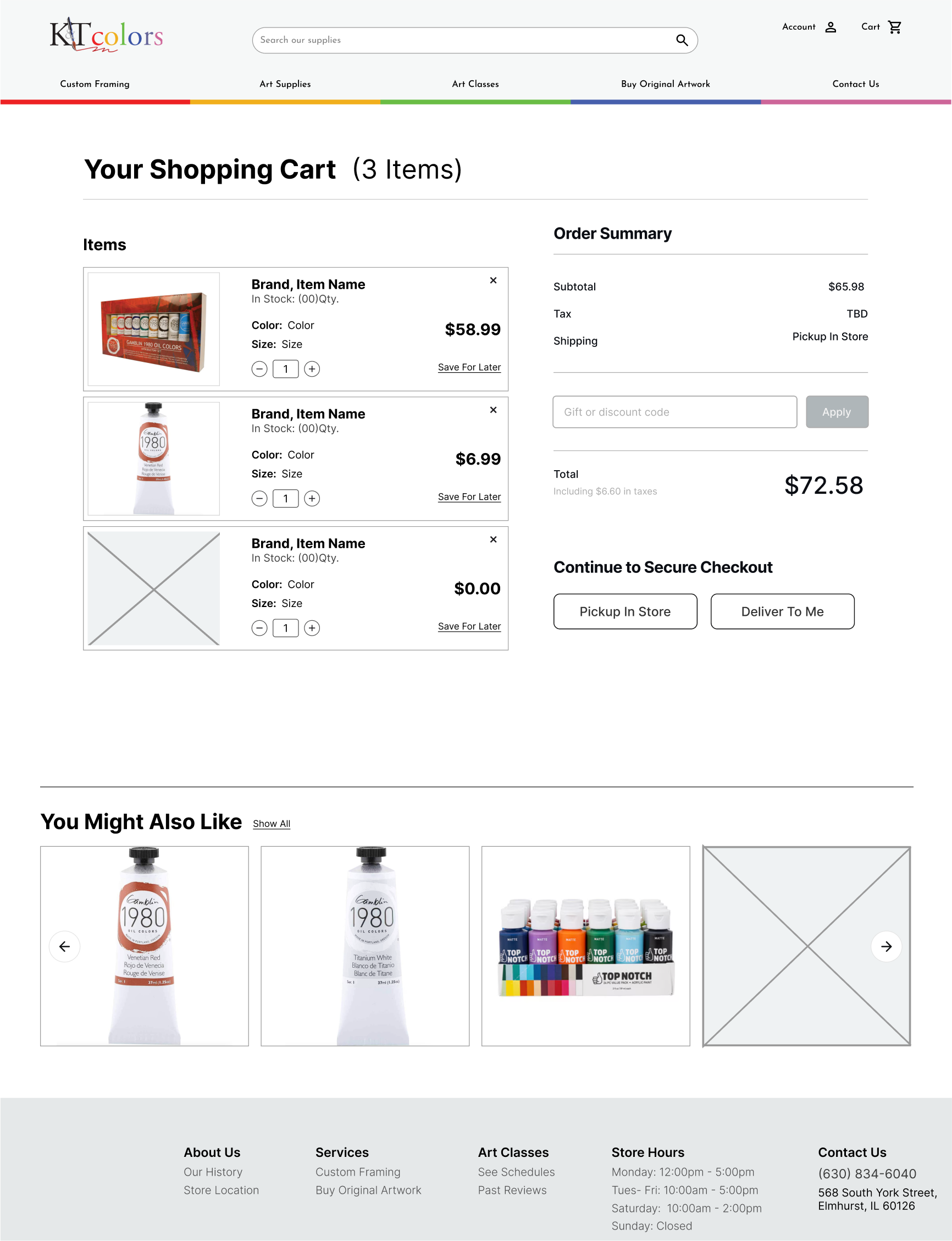
- Cart is only accessible through product pages
- Account page only accessible through product pages
Efficiency
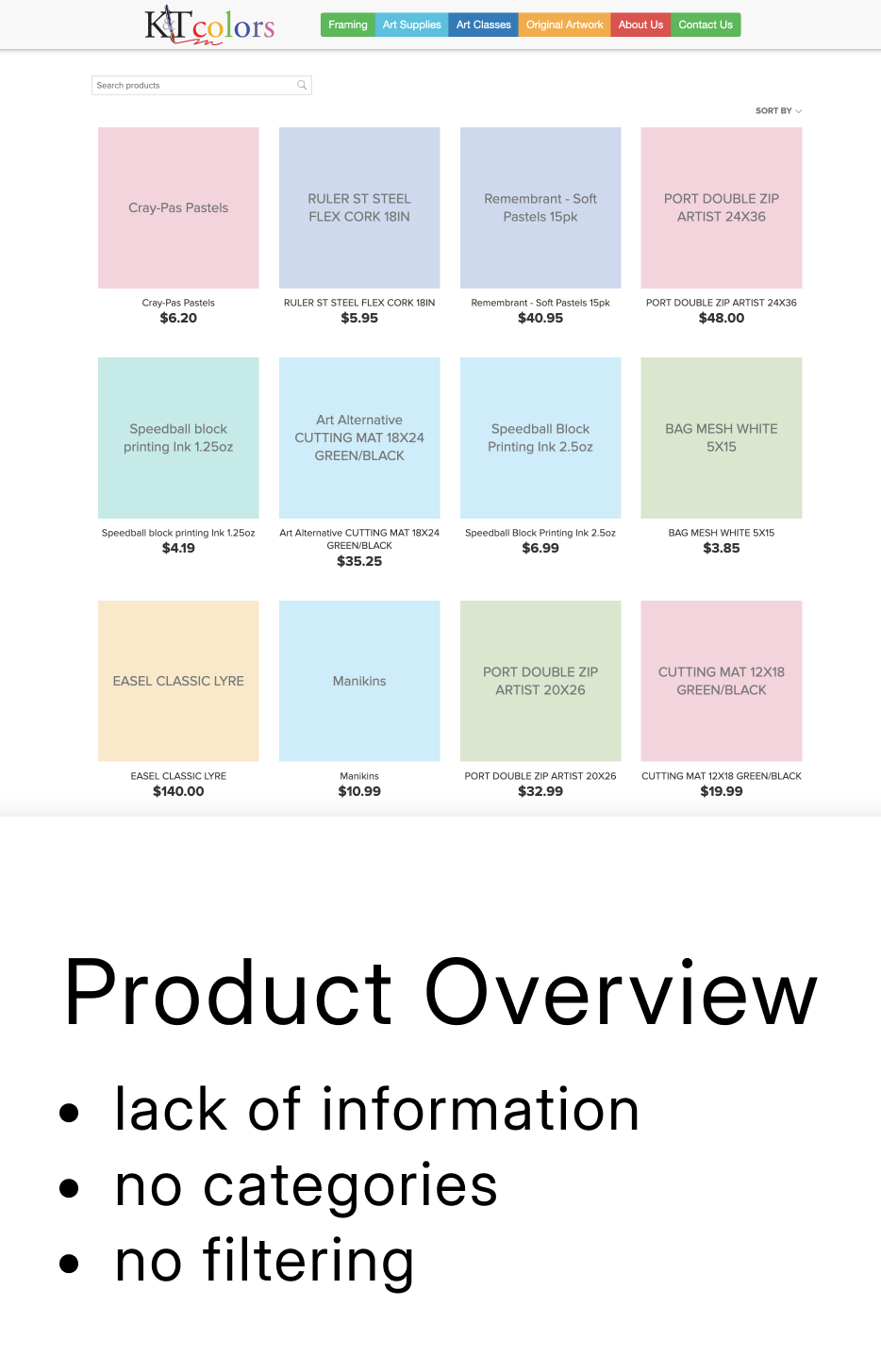
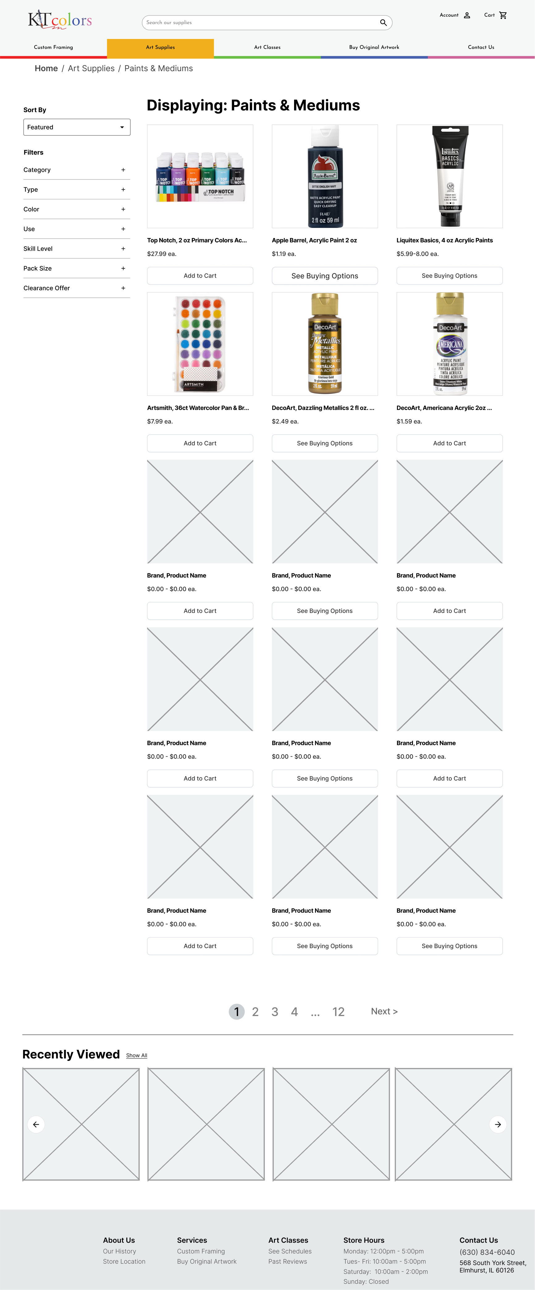
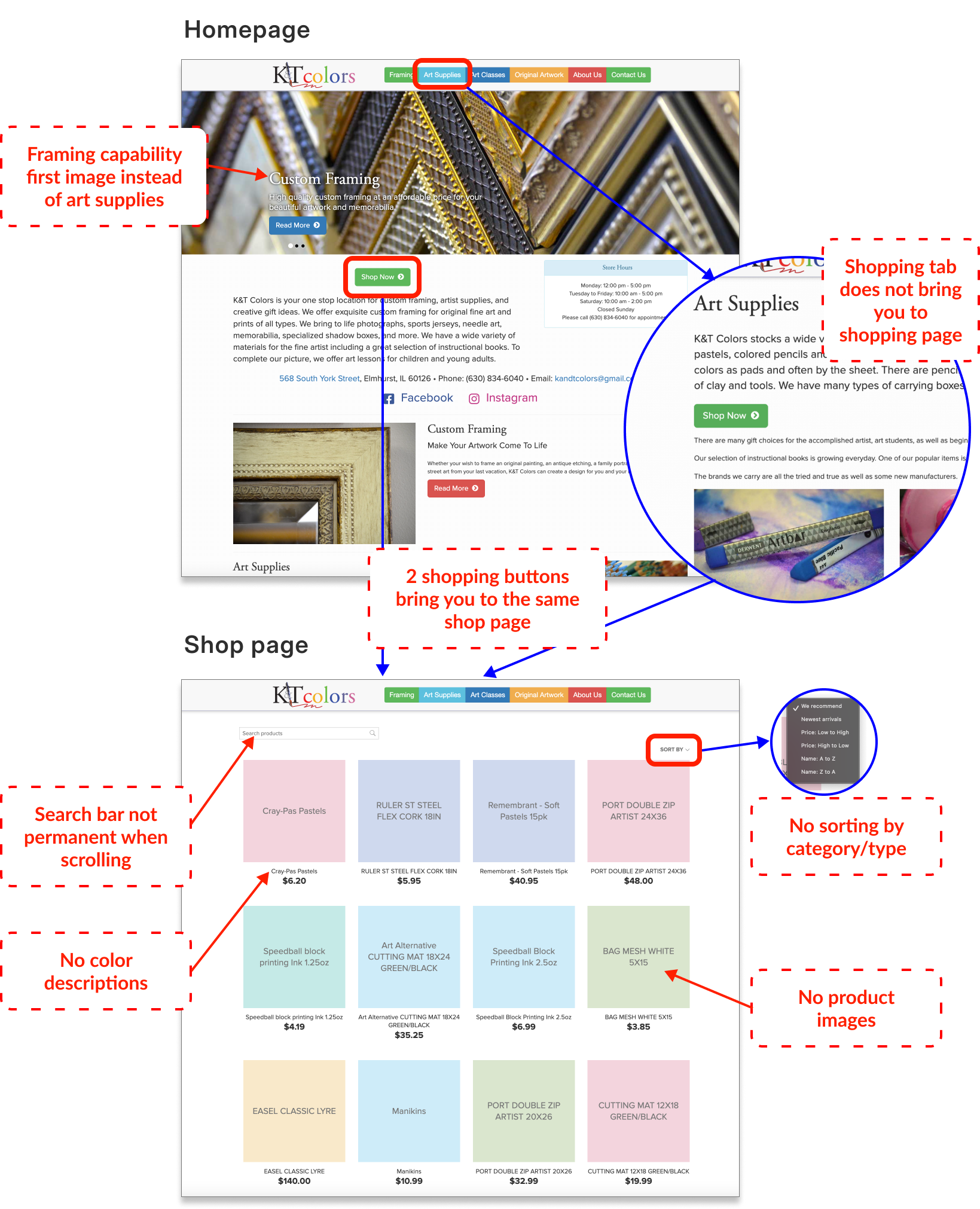
- Products do not have filters or categories
- Products do not have images
- Original artwork tab has "call for details" but no contact number listed
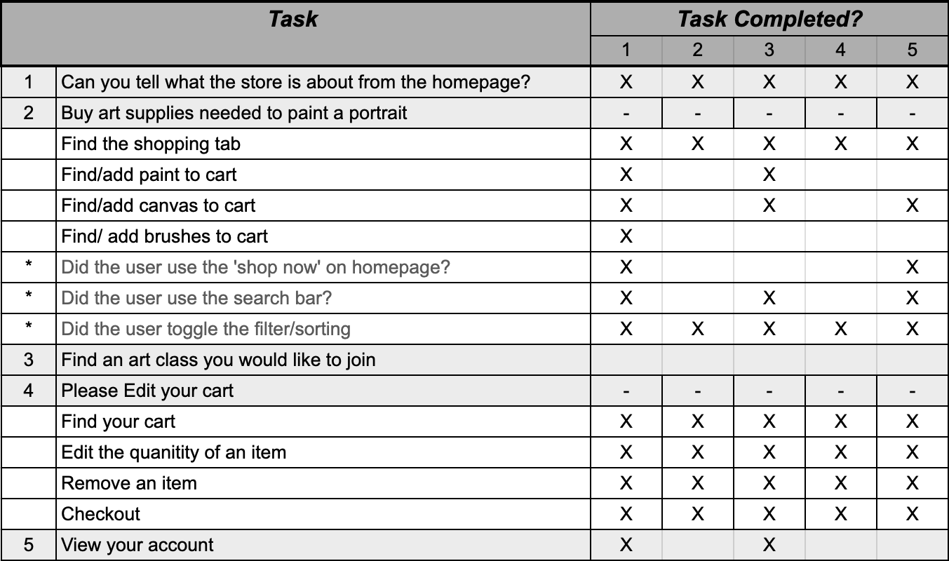
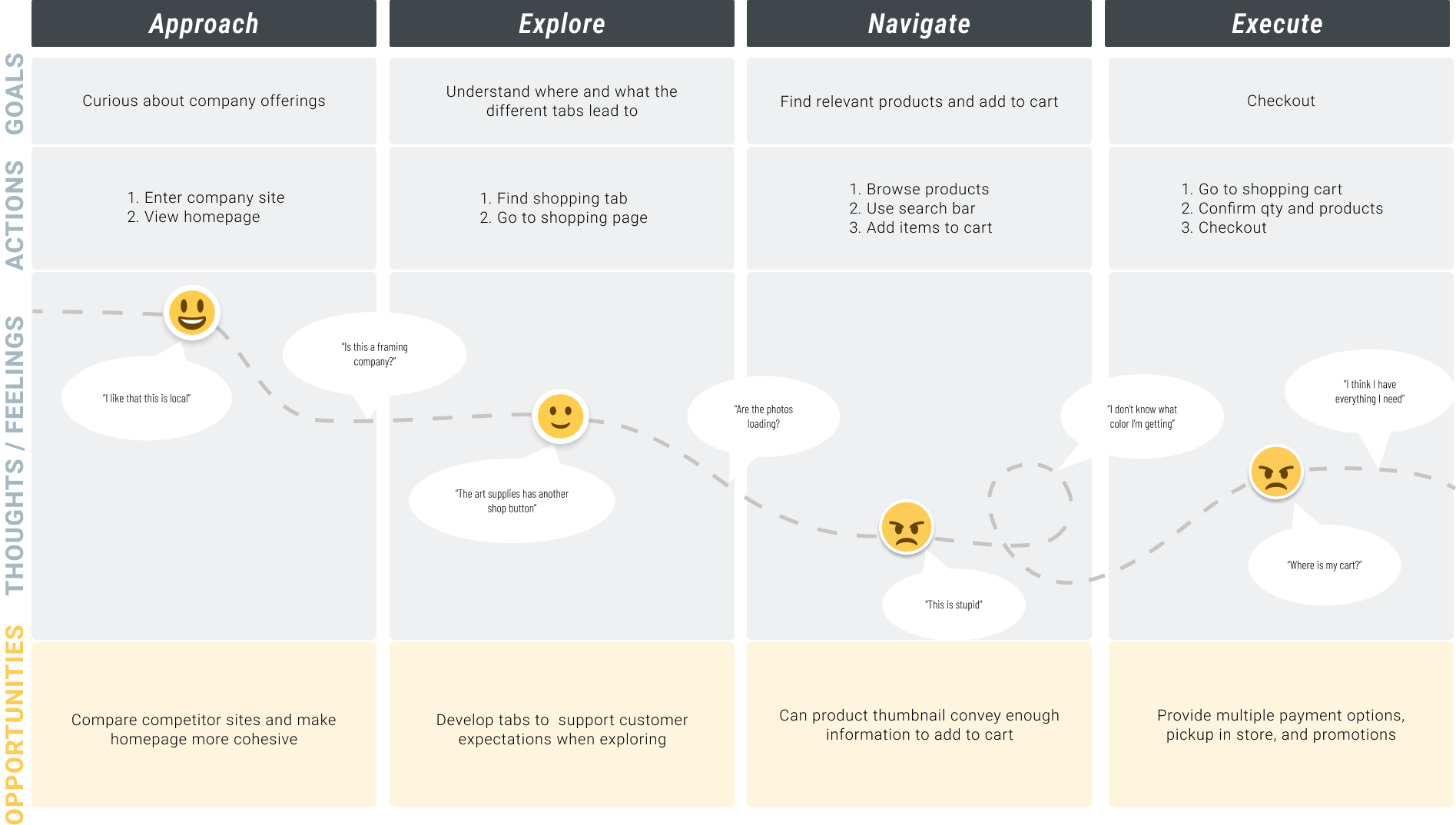
Understanding the Issue / Task Analysis
What we Learned
- Testers could easily tell what the business was about and liked that it was local.
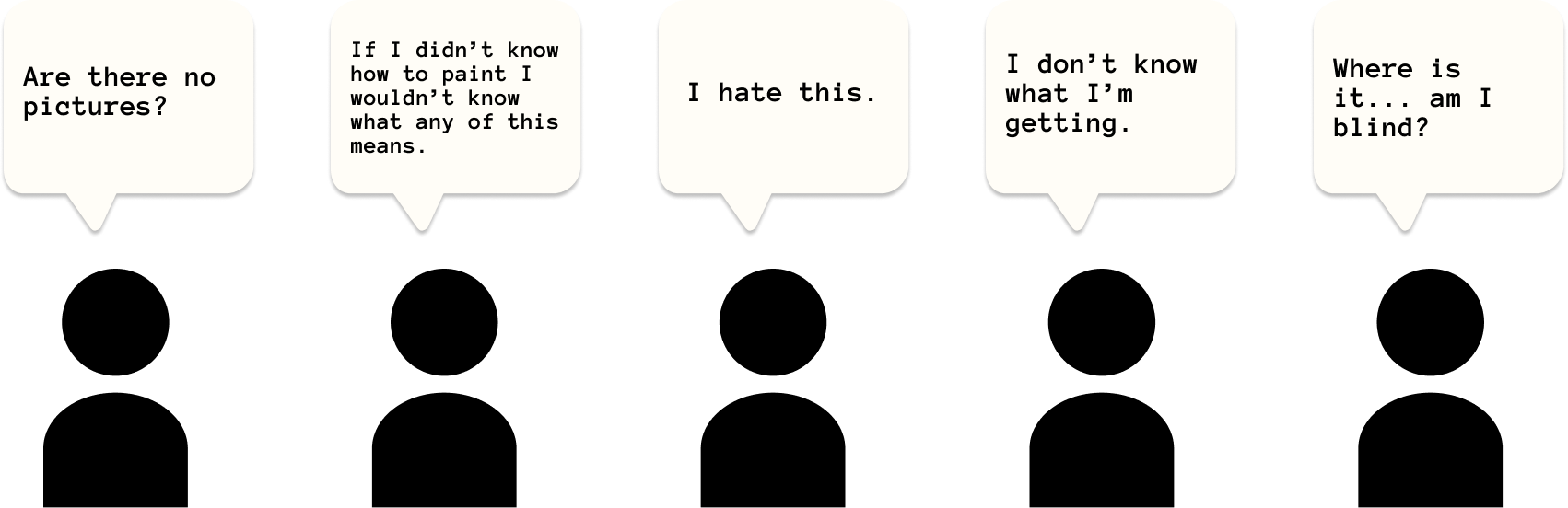
- Testers rely on photos and want to see exact color swatches when looking for products.
- Testers had the most difficulty when tasked with finding specific art supplies.
Empathizing with Users / Journey Mapping
User Info | "As an artist, I like to see what I am getting"
Scenario | I need to buy supplies to paint a portrait
Expectations | I want to quickly find supplies and checkout

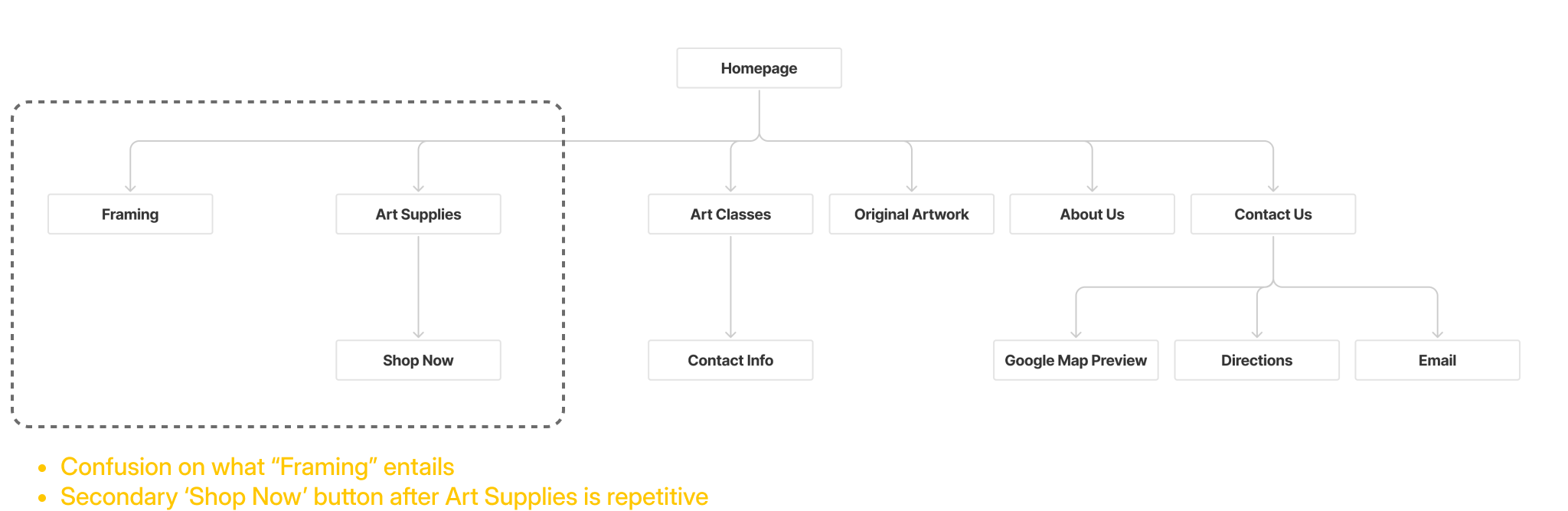
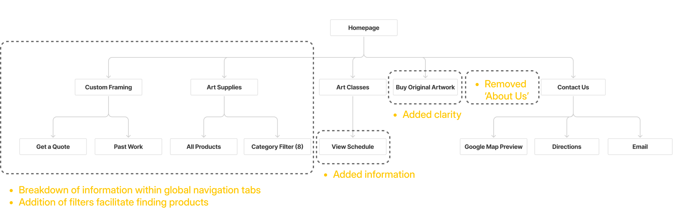
Approaching Navigation / Site Mapping
Site Map - Existing
Site Map - Revised
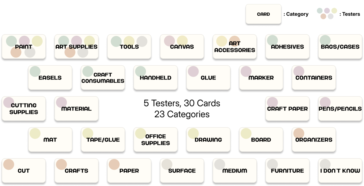
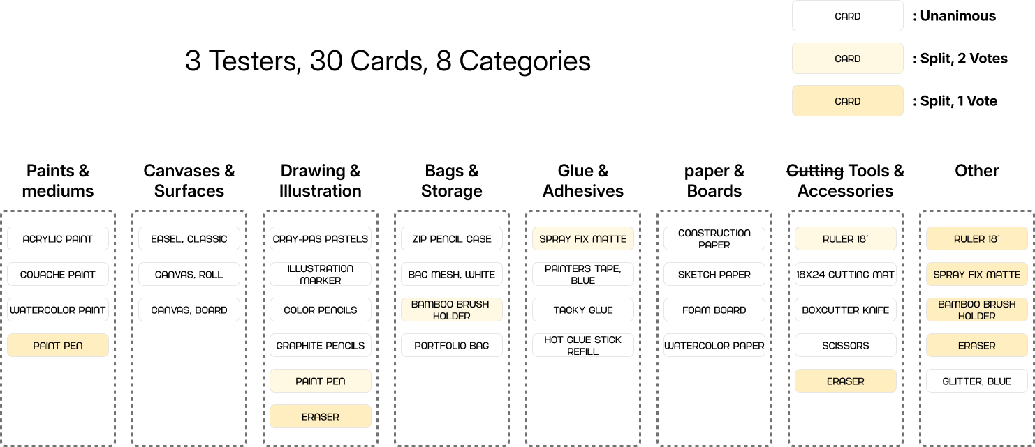
Organizing Information / Card Sort
Getting crafty can mean making art out of a range materials. How do we ensure that users can appropriately and efficiently filter or select the correct category to find what they need?
Open Card Sort:
Closed Card Sort:
Design Process
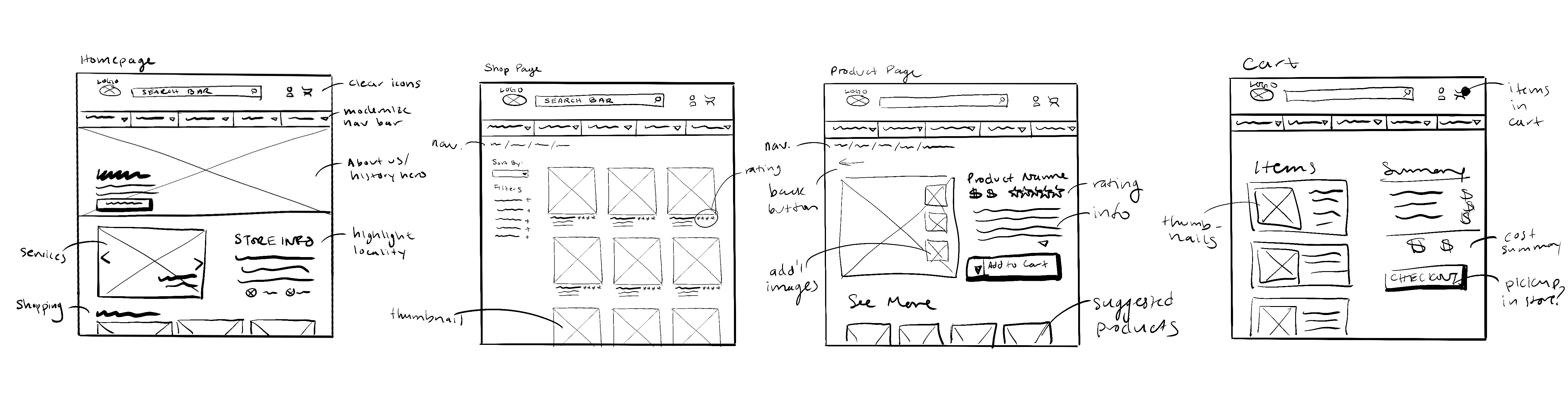
Ideation / Initial Sketches
From there, I started to sketch out the refreshed K&T Colors website. While I wanted to improve usability and navigation, I did not want to drastically change the business's visual identity so that it remained familiar to its local community.
Development and Testing/ Mid-Fidelity Wireframes
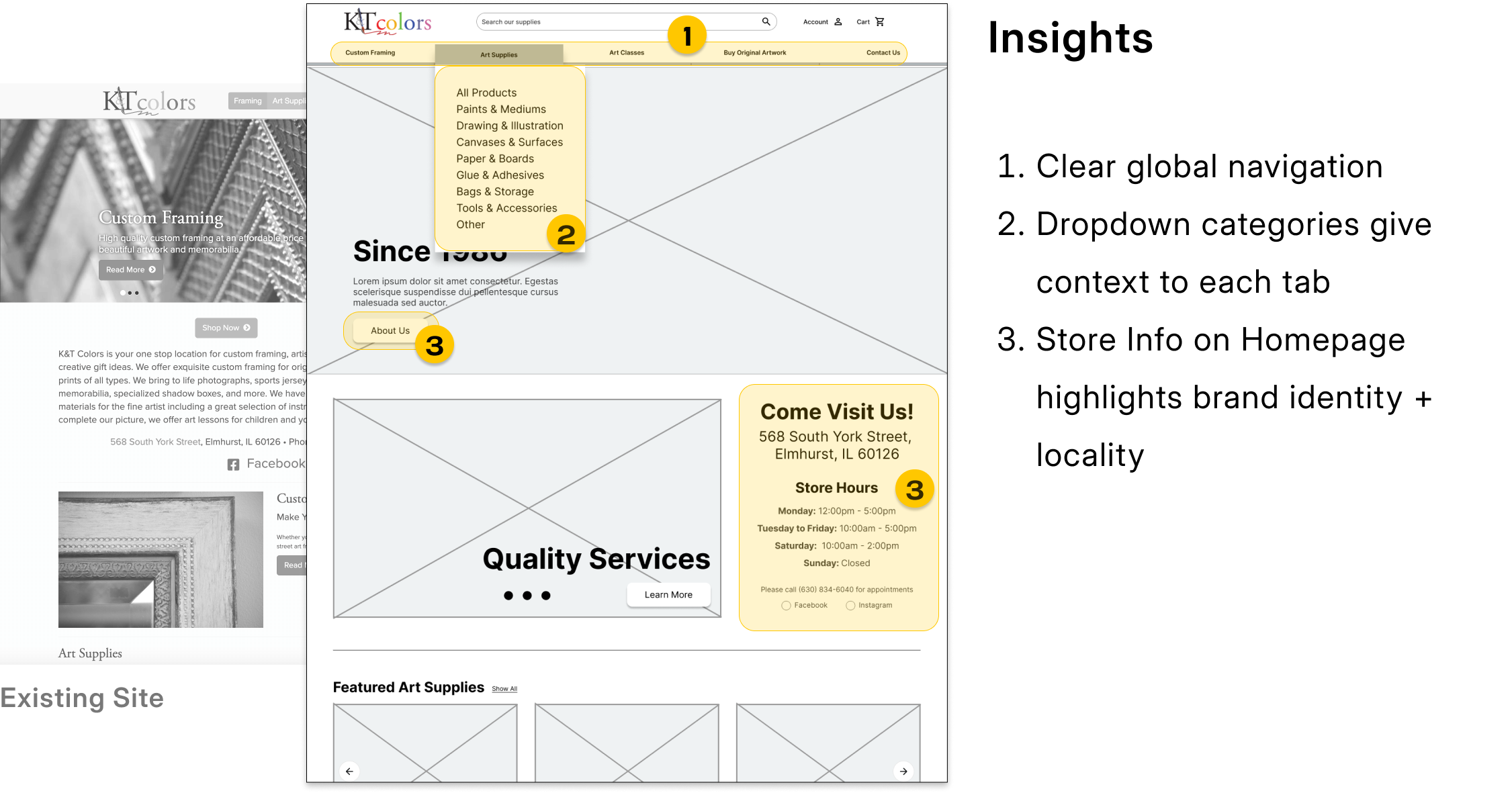
Homepage
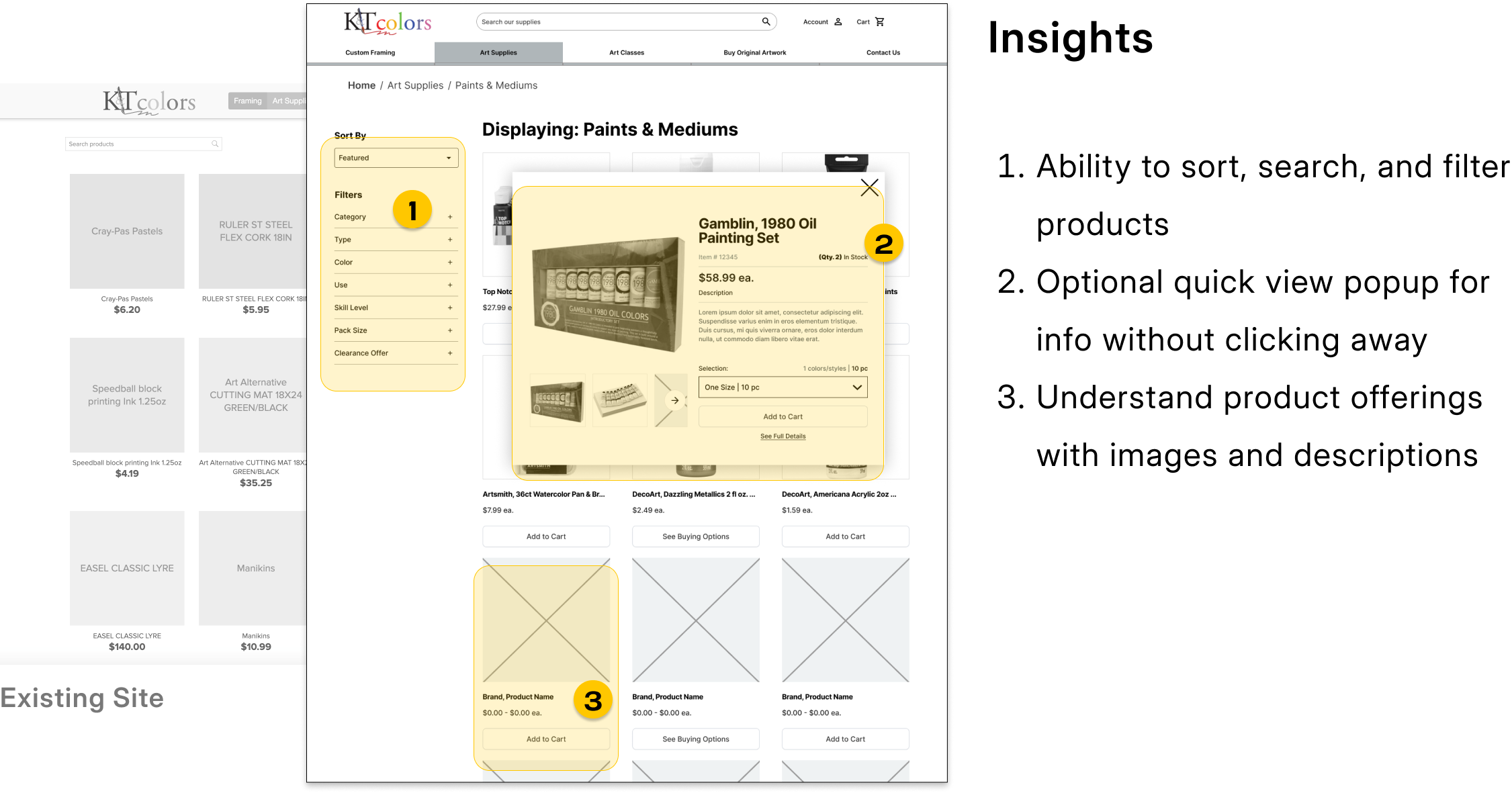
Product Overview
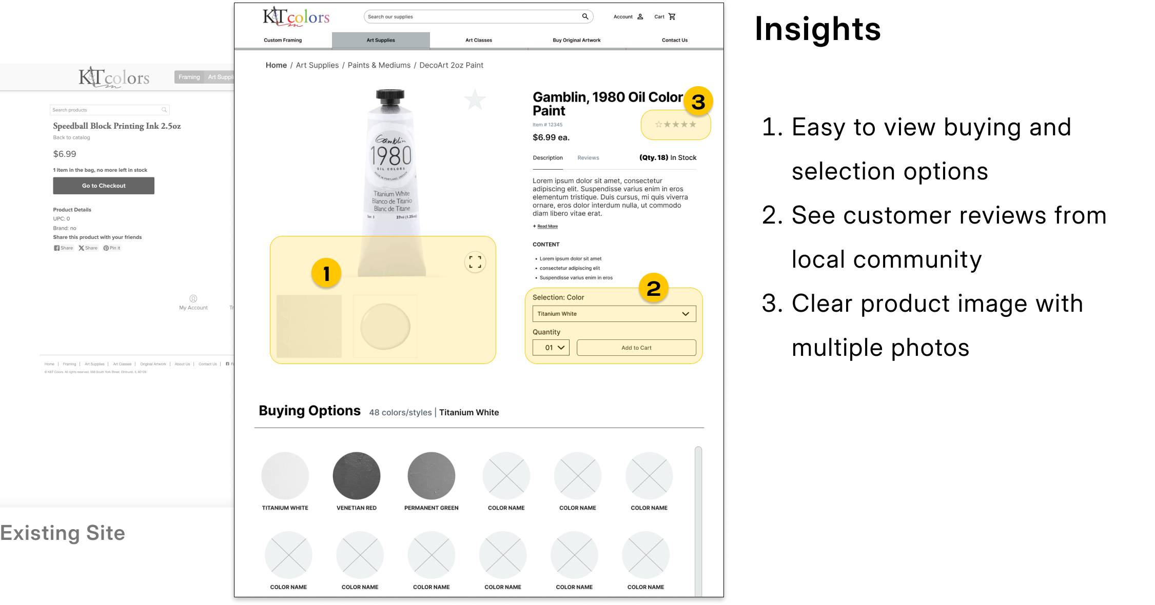
Item Page
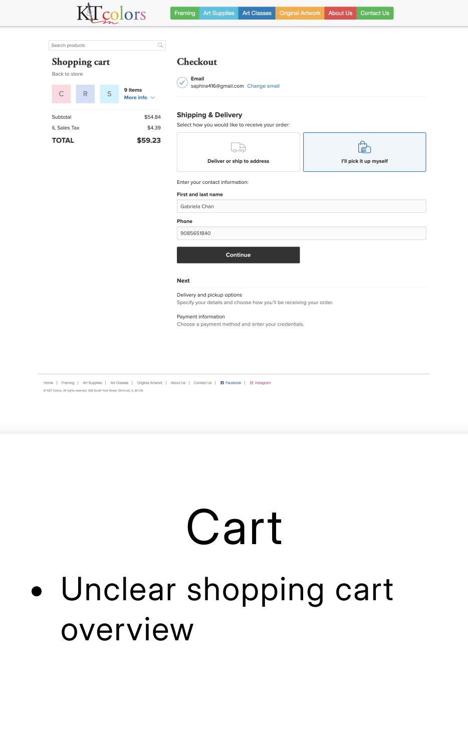
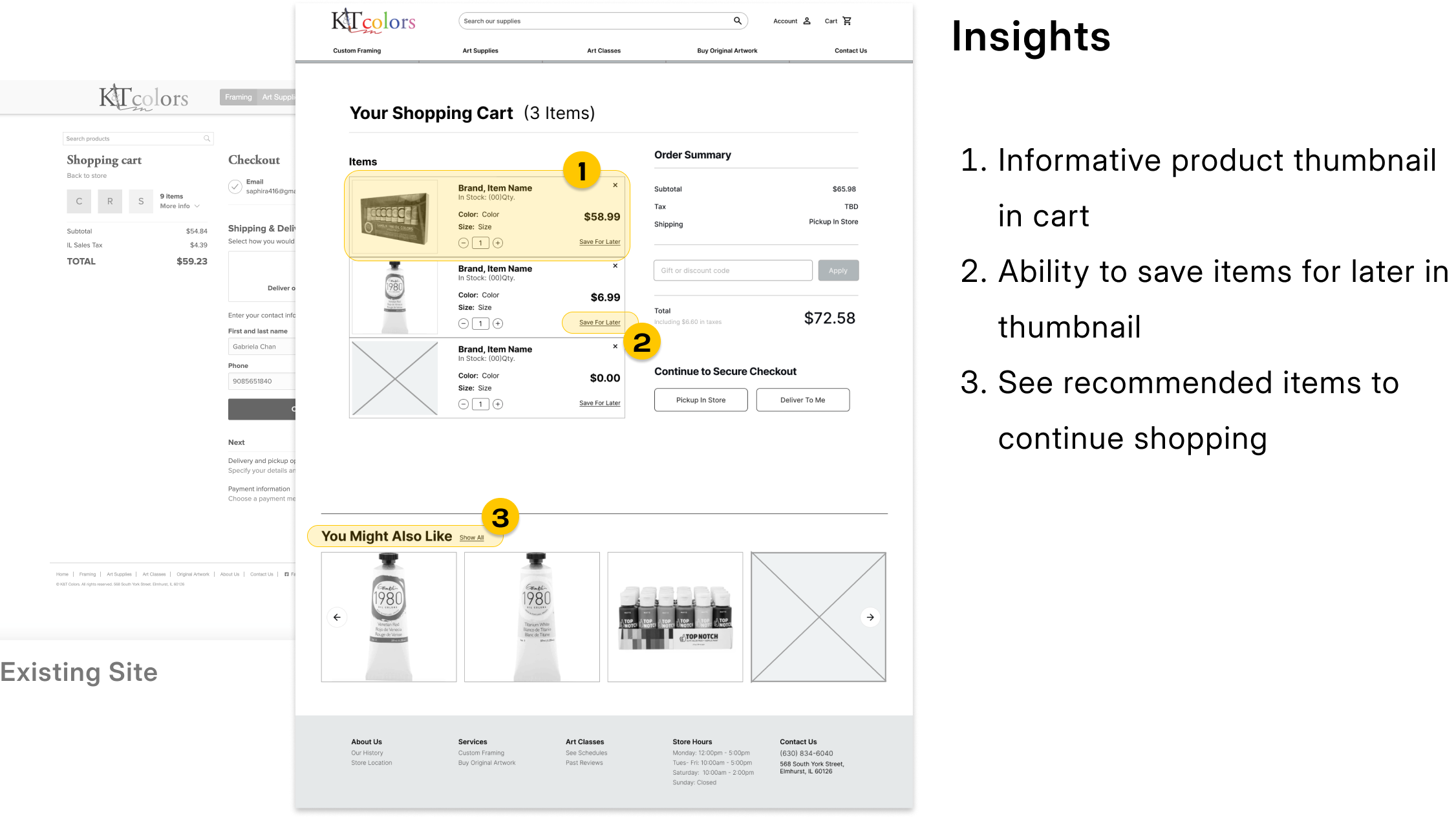
Cart Page
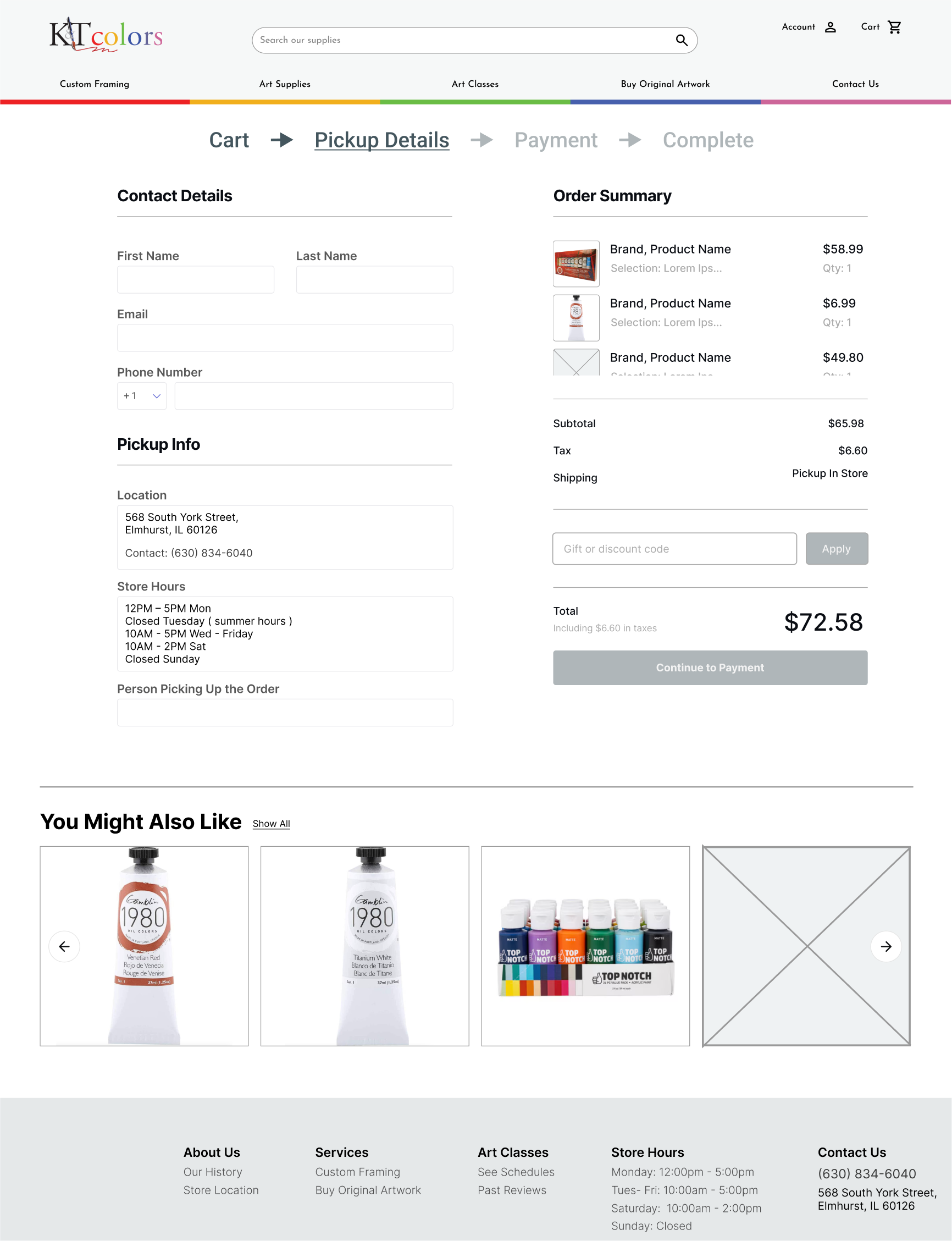
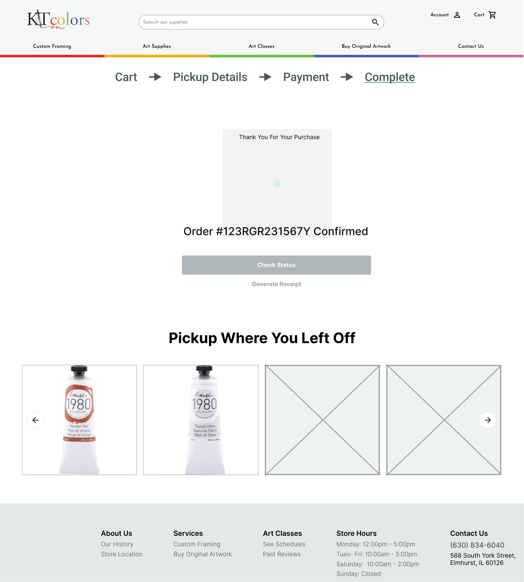
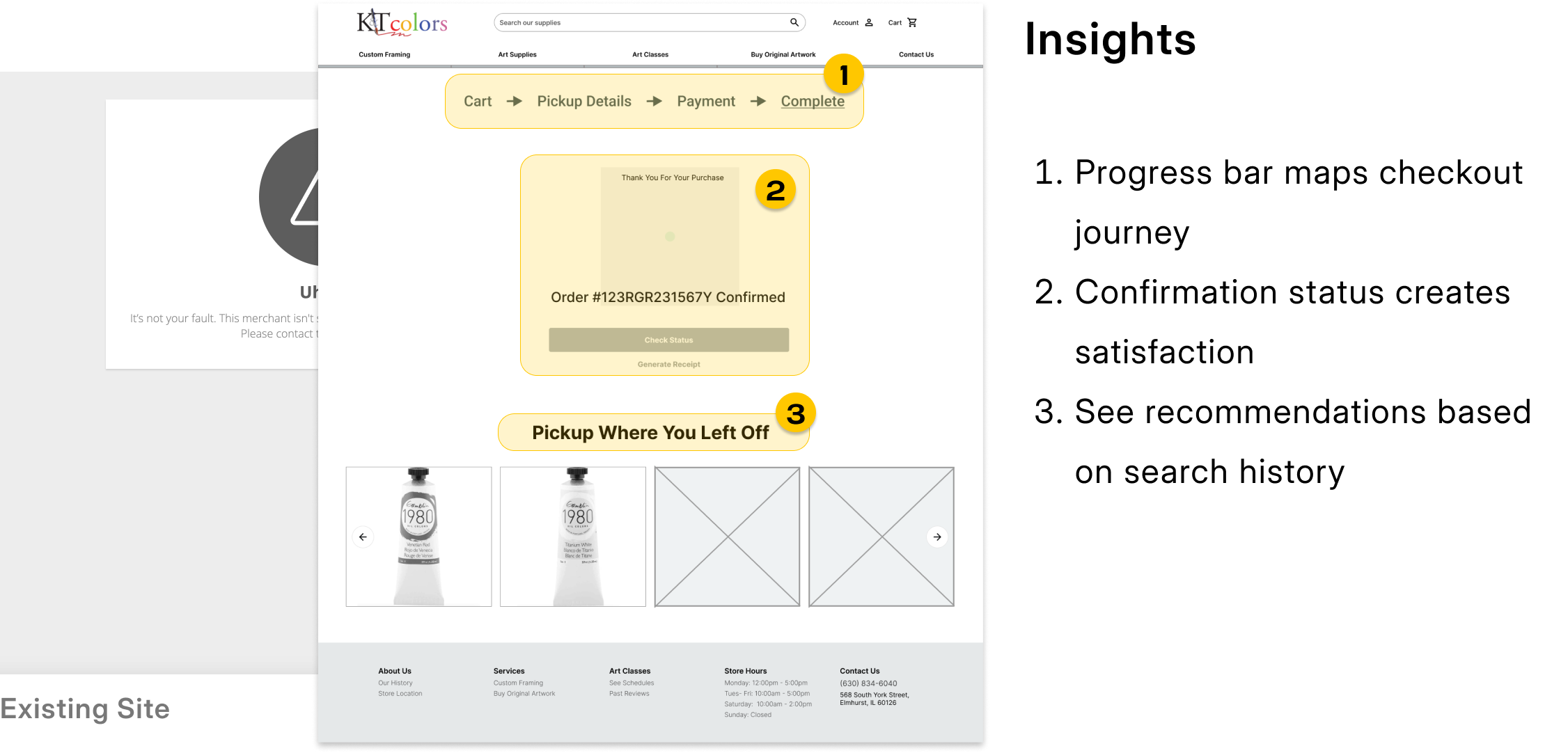
Checkout
Retrospective
Balancing modern updates with a brand's original identity was essential in keeping loyal customers happy. Listening to user feedback also helped me figure out what to keep and what to improve, and even small changes like adding photos and descriptions made a big difference. Moving forward, I would keep refining the site by improving the recommended shopping items, test the amount of information provided on each product, and potentially featuring more local activities.