
— User Research
— Mobile Design
— Web/UI
— User Testing
Current State

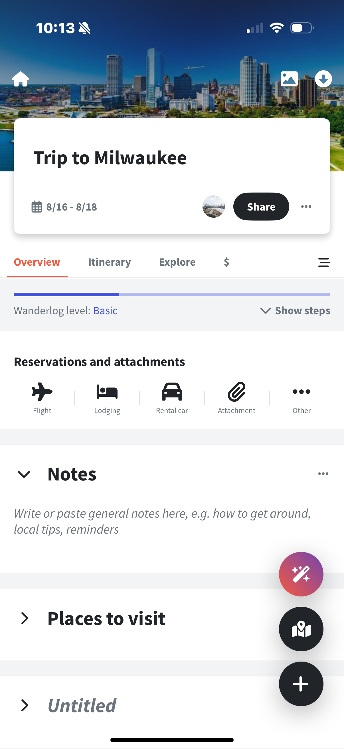
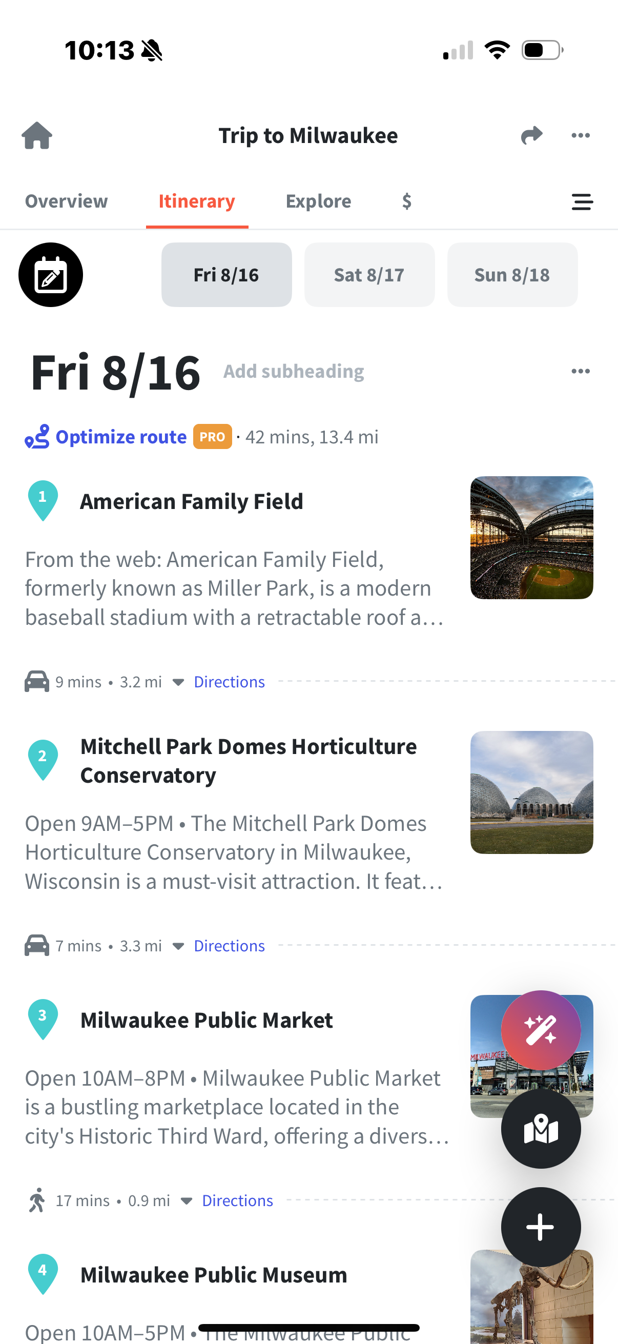
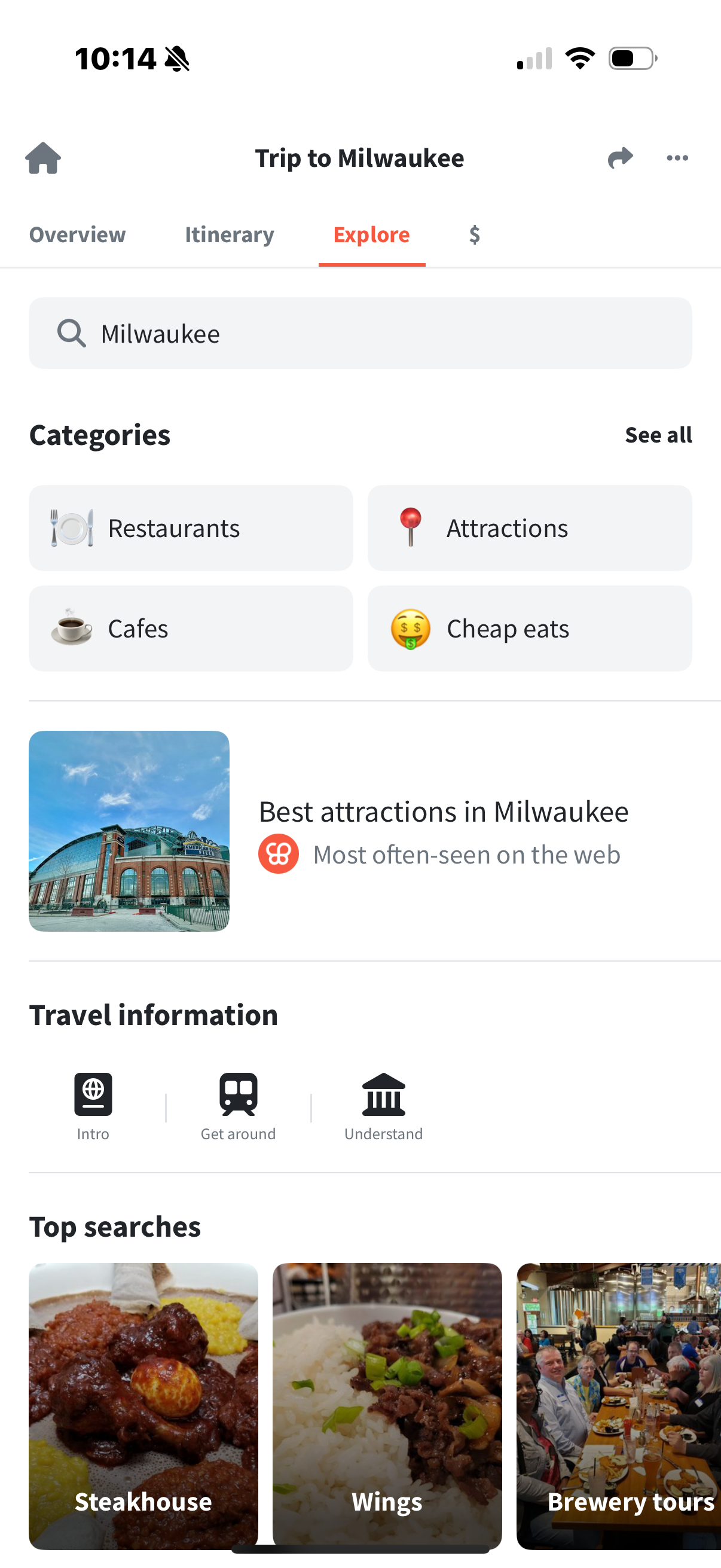
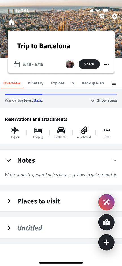
Overview
While Wanderlog simplifies itinerary planning and booking management, it lacked real-time adaptability, forcing users to juggle multiple apps during unexpected changes. Its rich feature set, though powerful, introduces a learning curve—especially for customizing plans or integrating external bookings—and can feel overwhelming for those seeking a more streamlined experience.
Aproach
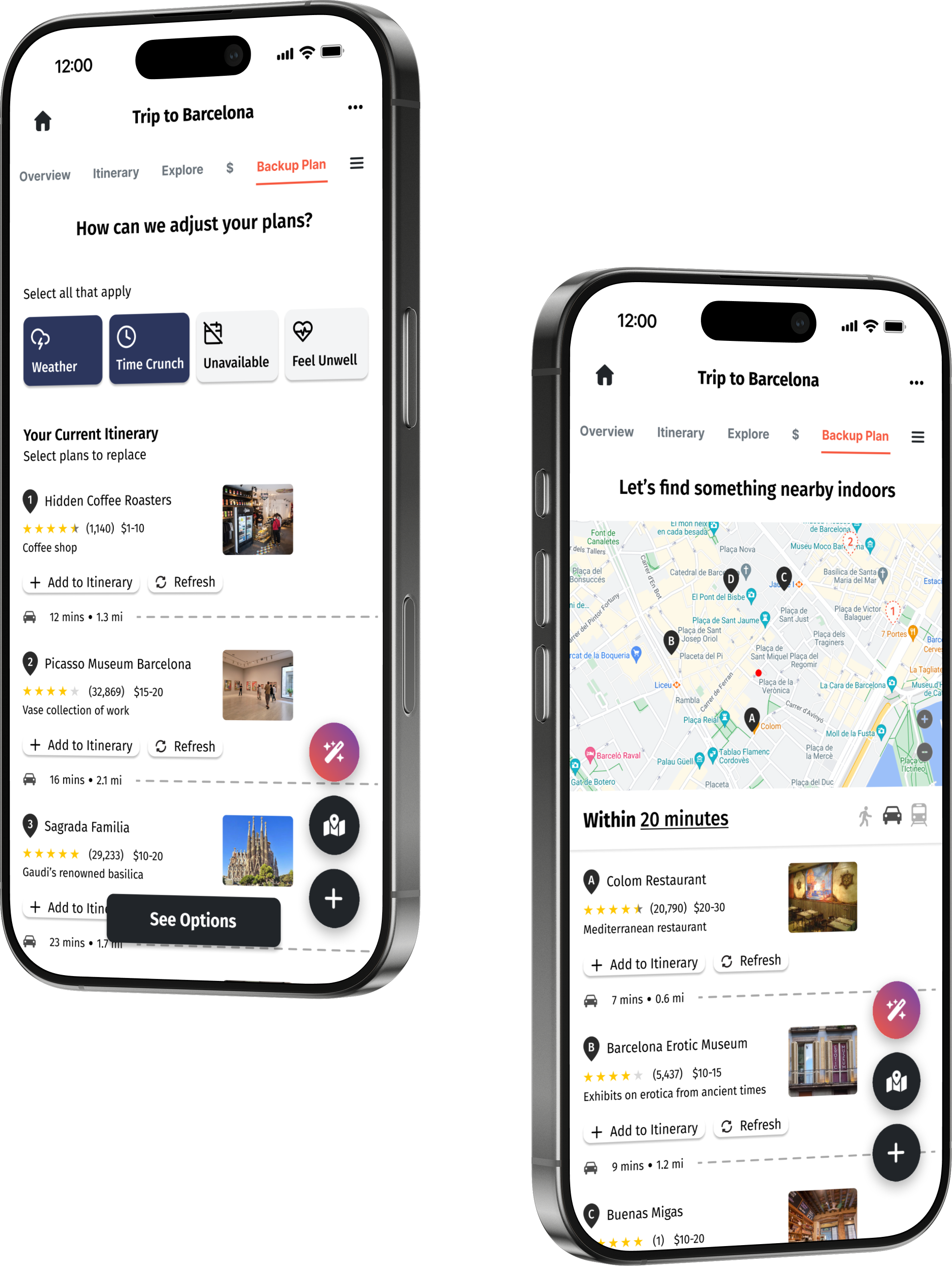
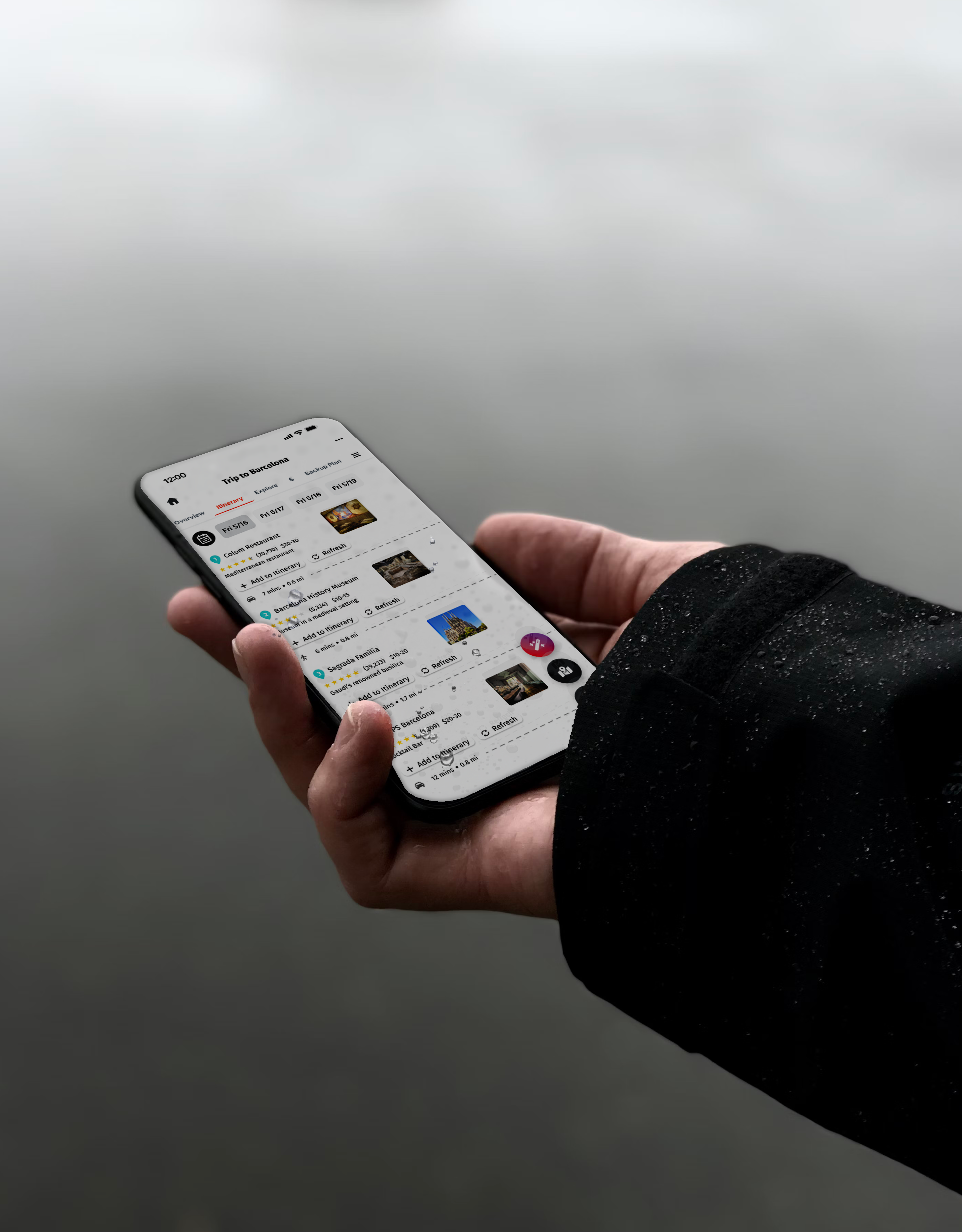
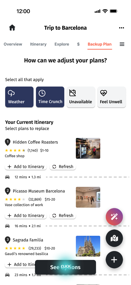
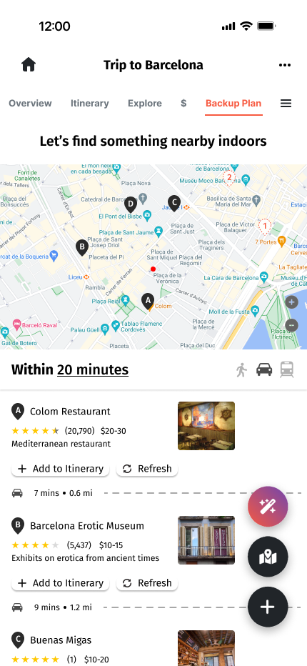
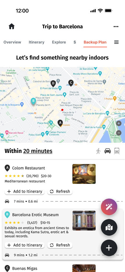
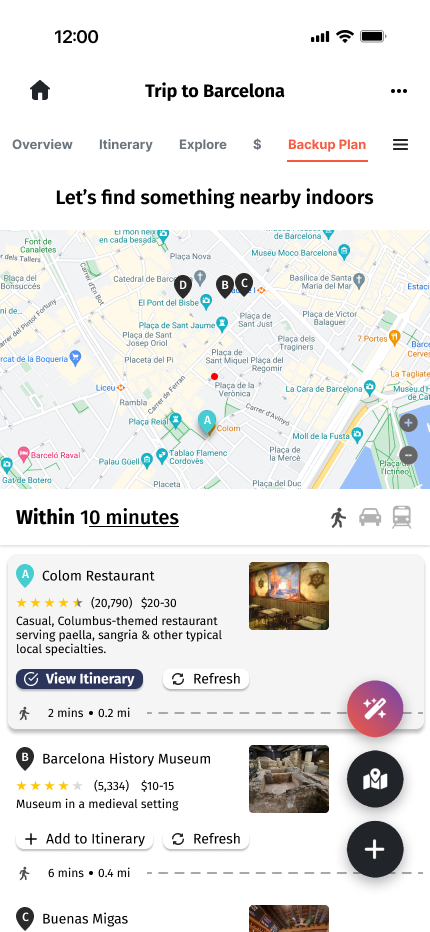
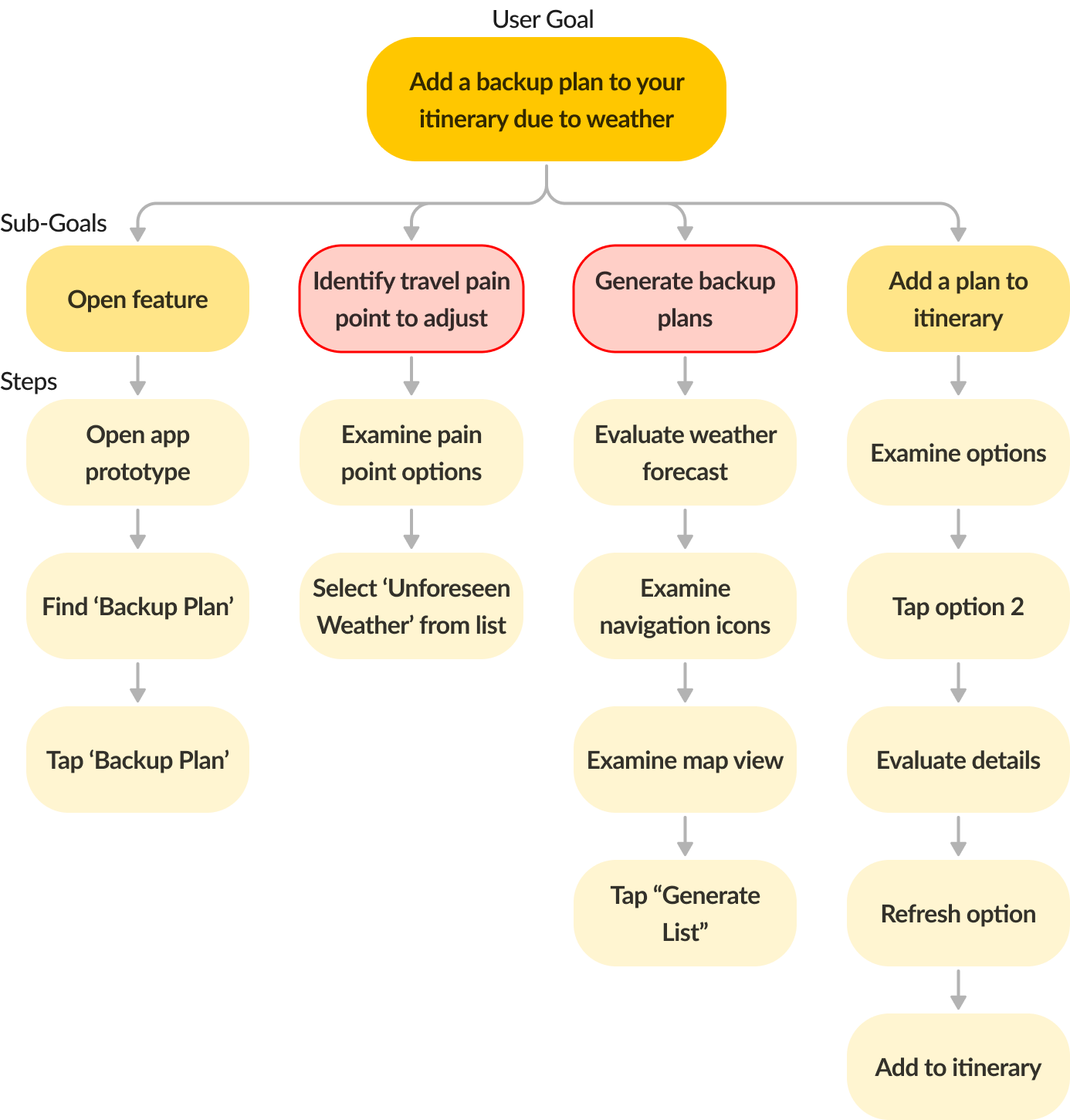
I designed a dynamic backup planning feature that integrates seamlessly into Wanderlog’s existing ecosystem. The feature proactively generates alternate plans based on a user's current itinerary and adapts to real-time disruptions such as weather, closures, or delays—minimizing stress and app-hopping. Users gained the ability to confidently pivot plans without leaving the platform, improving overall travel flow and satisfaction—especially in unpredictable scenarios.
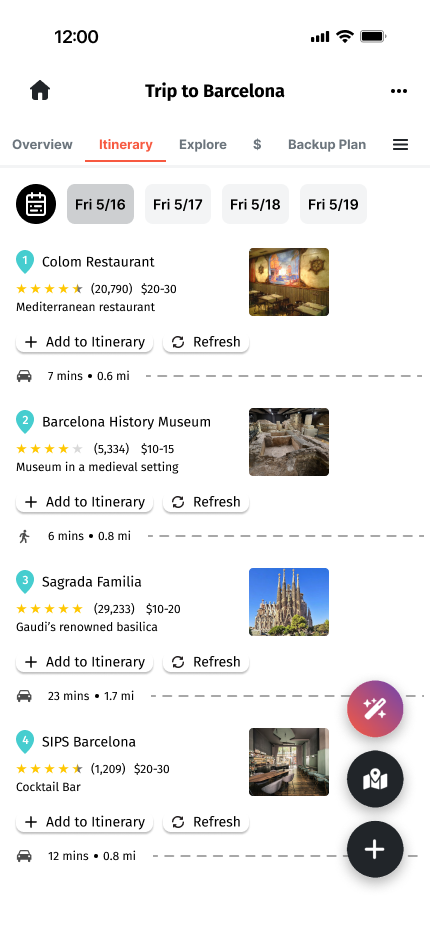
Final Wireframes
Research + Ideation
Empathizing with Users / Interviews
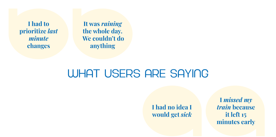
I interviewed 8 users with varied travel experiences and methods for planning their itineraries. After asking 10 questions about their goals and frustrations with planning travel.
What We Learned from Interviews
- Some users prefer flexibility over a fully planned itinerary
- Users rely on their community for recommendations
- Users use tools like Google, TripAdvisor, and Social media to do research
- All users have had a trip not go as planned

Understanding the Issue / Affinity Mapping
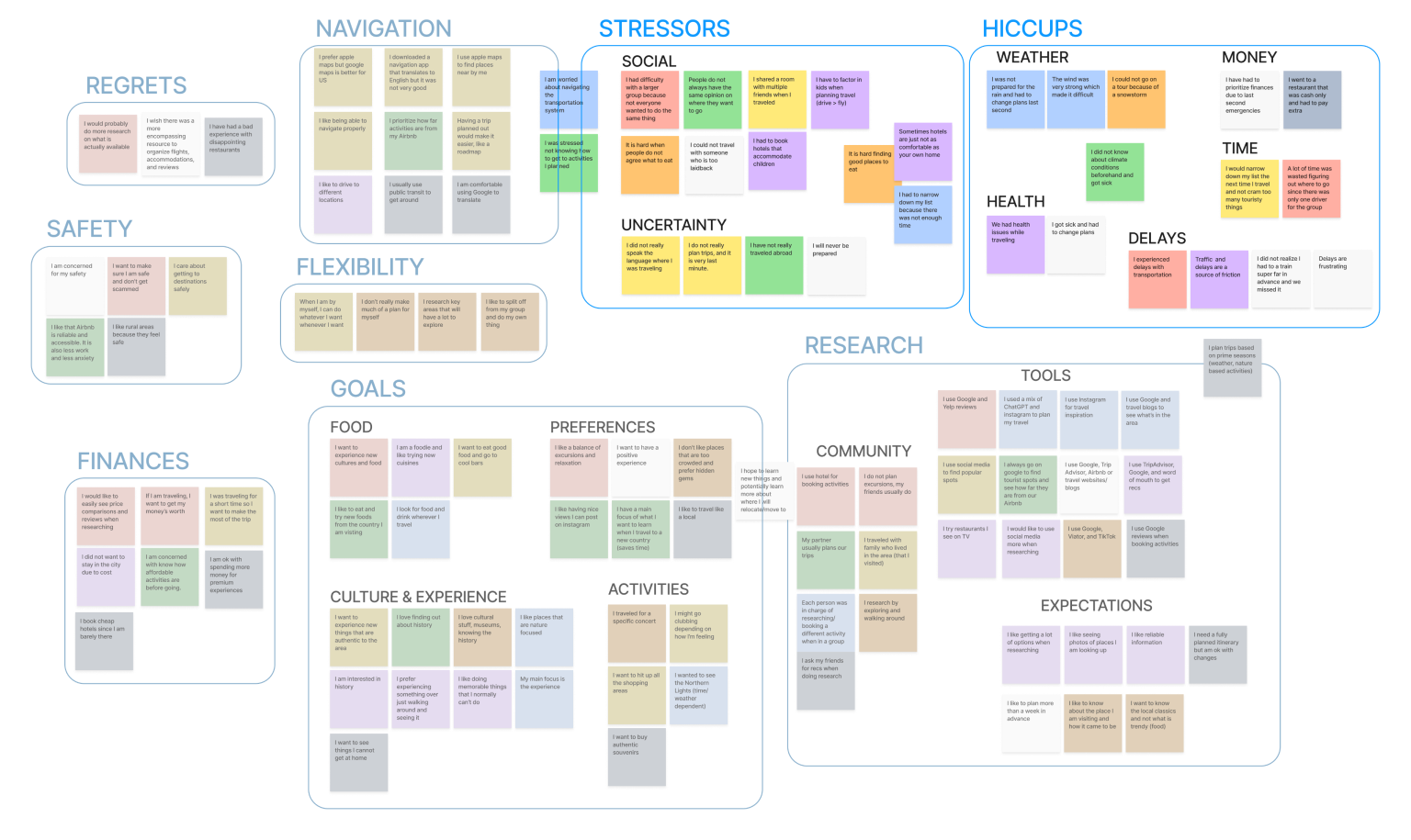
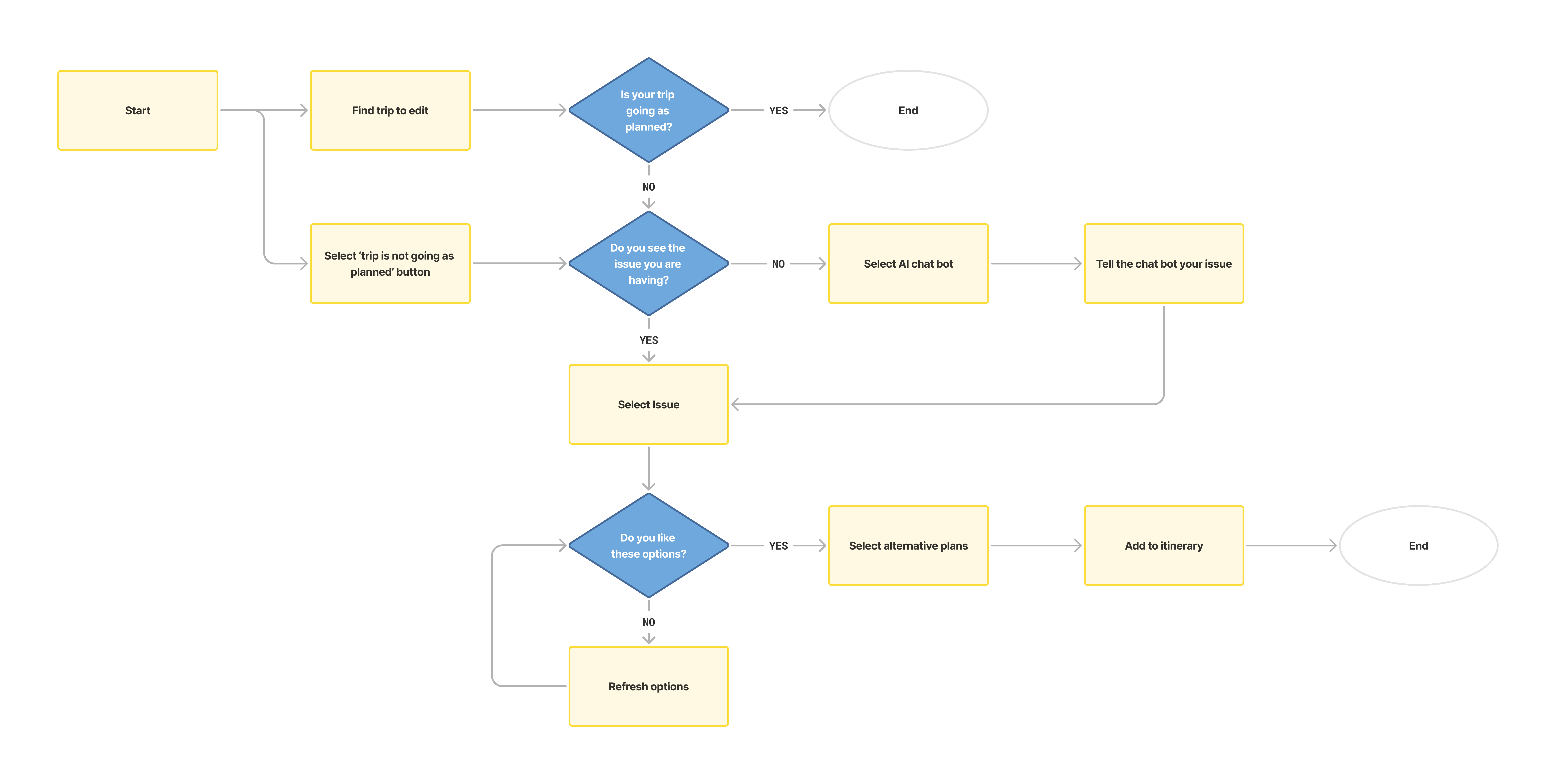
How might we help users overcome specific roadblocks by discovering alternative plans without leaving the app?
Design Process
Brainstorming Layout / Sitemap
If you are stressed out during travel, the last thing you want to see is an overwhelming amount of options. I aimed to create a feature that directly targets the setback someone is experiencing by consolidating core issues into easy to navigate buttons based on what user wanted.
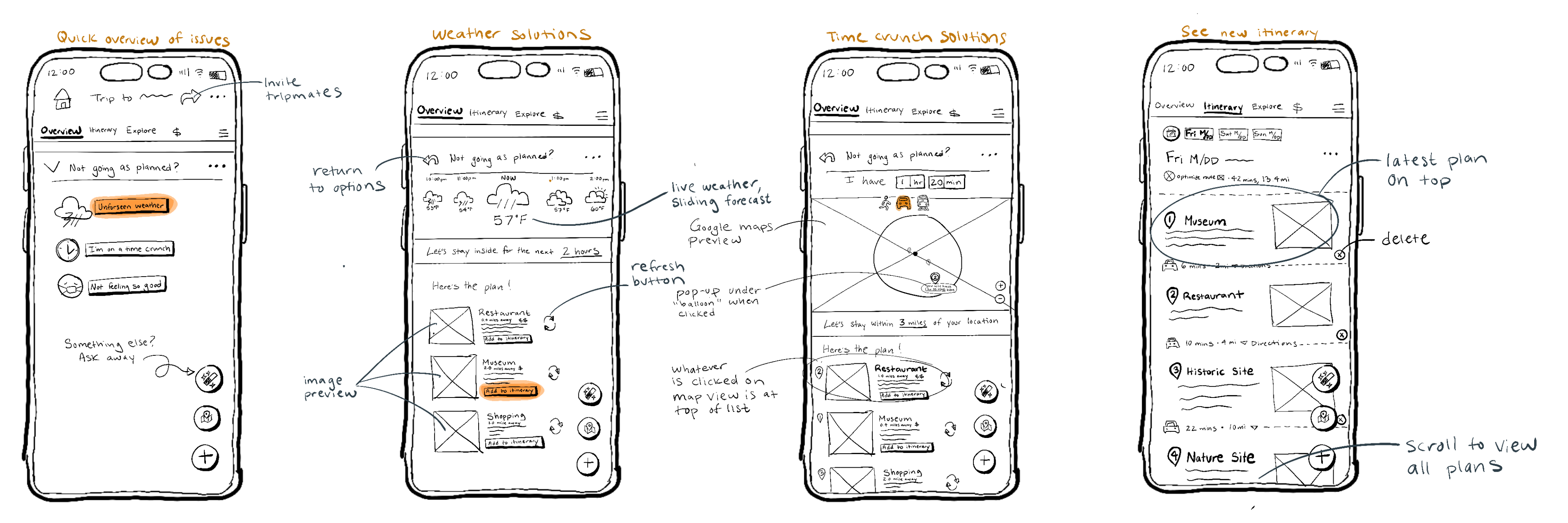
Ideation / Initial Sketches
After mapping the user flow, I built out two flows tackling the ‘Unforeseen Weather’ and ‘Time Crunch’ solutions. Features like live weather or toggle-able time considerations aid in users making their best decision.
Mid-Fidelity Wireframes
Identifying Pain Points / Task Analysis
Four users were provided with a goal of using the backup plan feature to replace their plans due to unforeseen weather. It became clear that the navigation was unclear and users were overwhelmed with information.
Key Takeaways
- Issues Panel is not clear and some users might face multiple issues
- Too many clicks to reach a solution
- Amount of information is overwhelming
- Transit information is confusing, feels like the main focus
- Users want to see their existing itinerary to pinpoint what plans need to be replaced
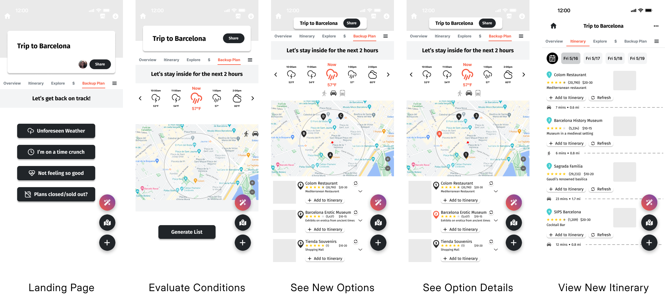
Final Wireframe Adjustments
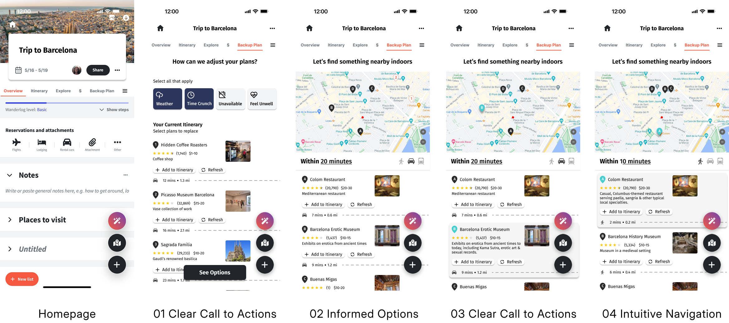
Key Changes
01 One page to toggle issues instead of leading to separate pages; select a specific plan from existing itinerary
02 Removed unnecessary data like live weather to avoid user fatigue
03 The refresh button has more context and improved location
04 Transit icons have less impact and more context
Retrospective
Listening to user feedback and adjusting the project direction during research was a challenge, but it ultimately led to a better final product. Working within Wanderlog's existing app and maintaining their visual identity also added another layer of complexity. Since the feature is driven by user needs, testing and iteration were key to building something efficient and effective. Engaging with users in both early stages and later in development was crucial in identifying pain points and validating design decisions.