
— Brand Style Guide
— UI Research
— Task Analysis
— Prototype
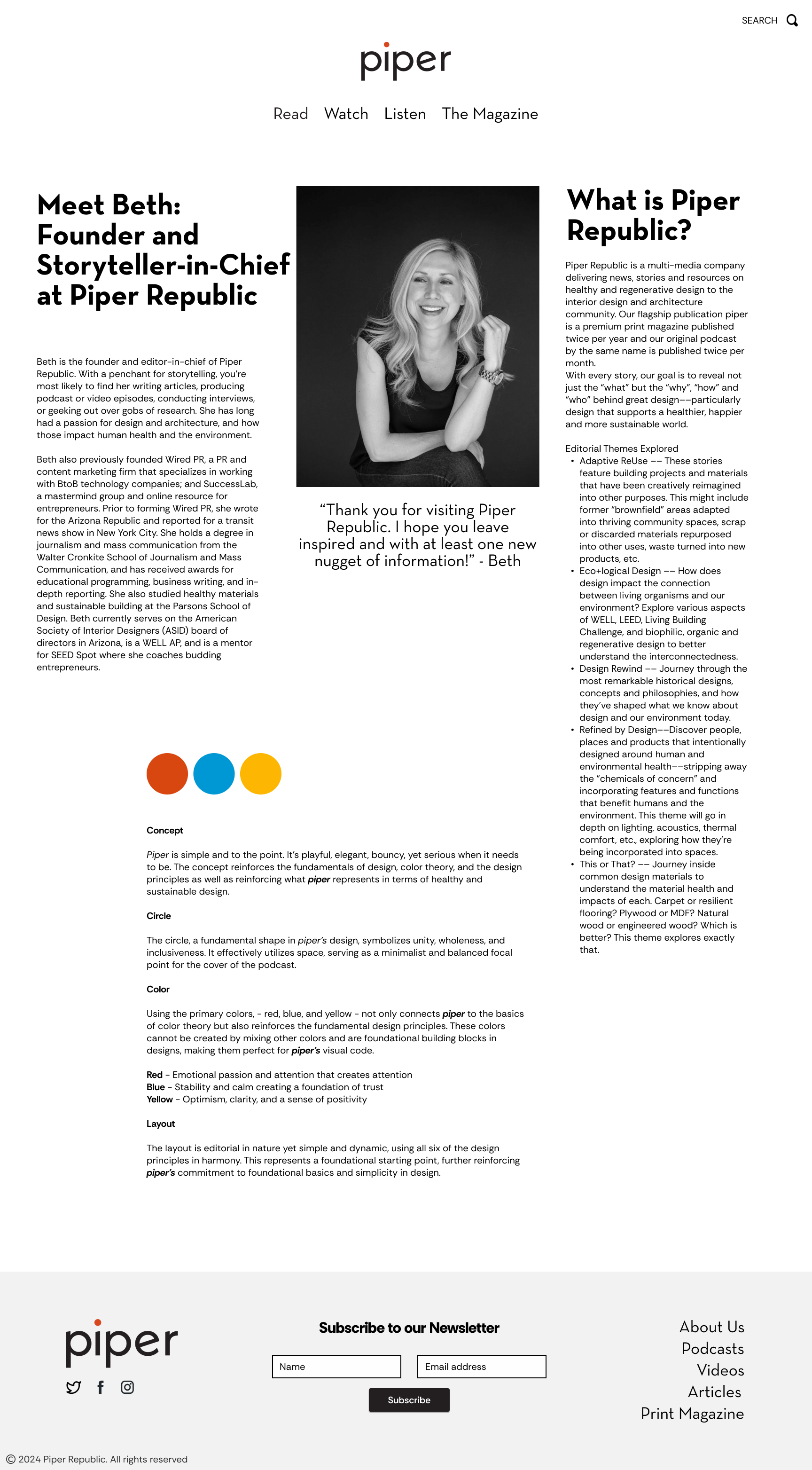
Current State
Overview
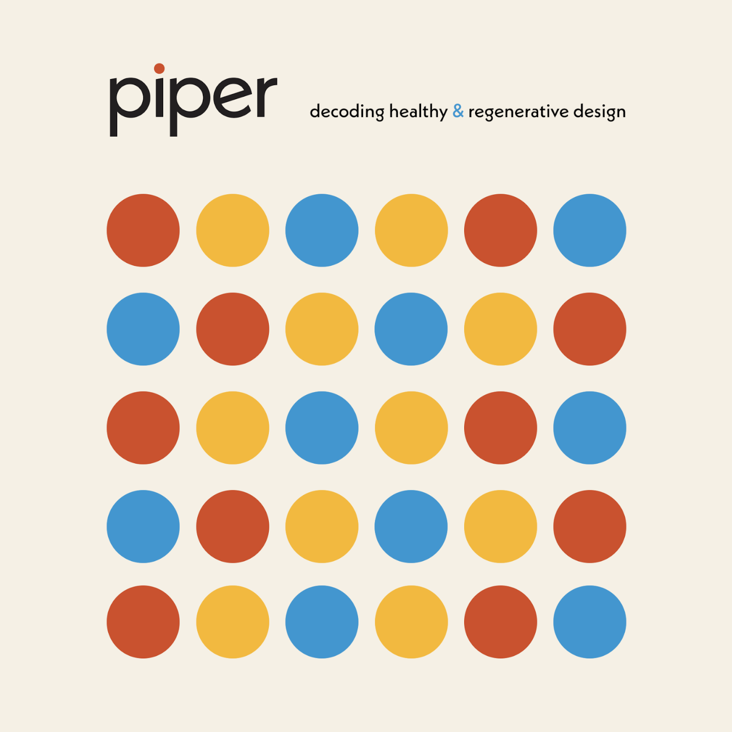
Piper is simple and to the point. It’s playful, elegant, bouncy yet serious when it needs to be. The style and design of the overall brand is pleasurable, consistent, and easy-to-use design. The primary colors—red, blue, and yellow—reflect the fundamentals of color theory and design principles, serving as foundational building blocks. The editorial yet dynamic layout harmonizes all six design principles, embodying Piper's commitment to simplicity and foundational design.
Aproach
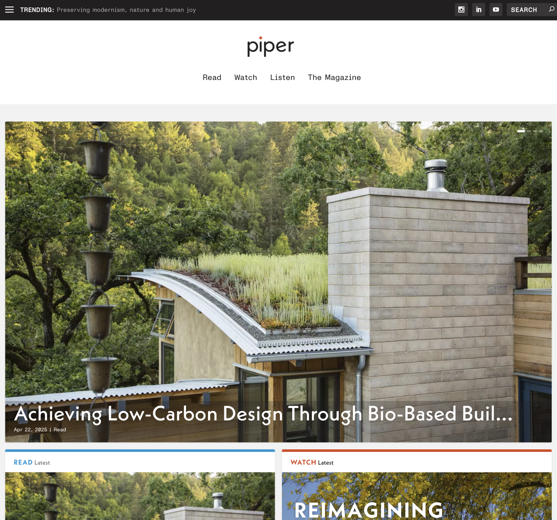
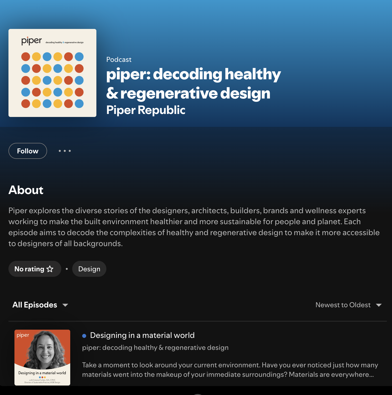
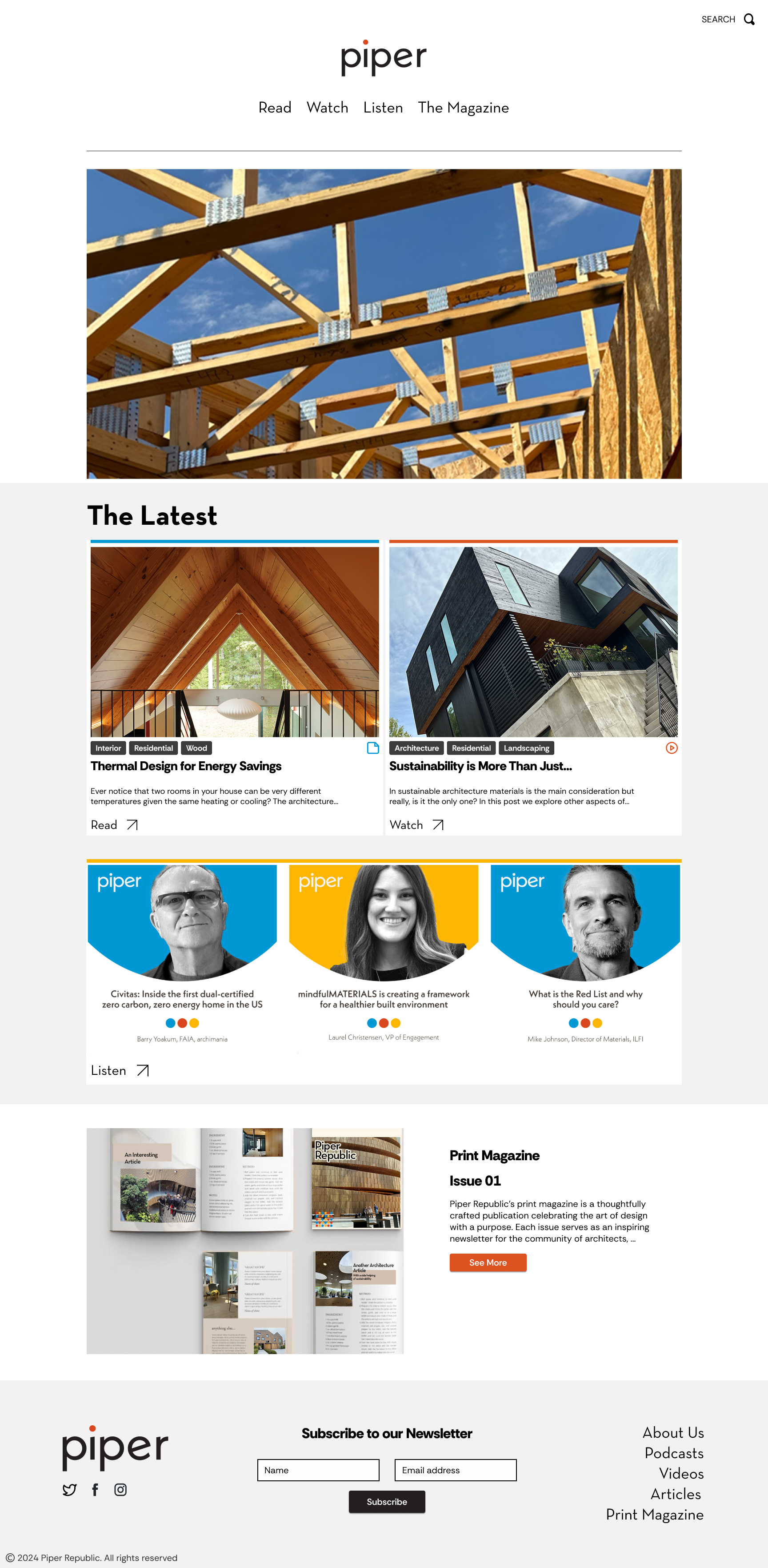
I led the website redesign with a focus on usability, scalability, and visual clarity. By streamlining navigation, improving content hierarchy, and building a flexible design system, I created a more intuitive and visually engaging browsing experience.
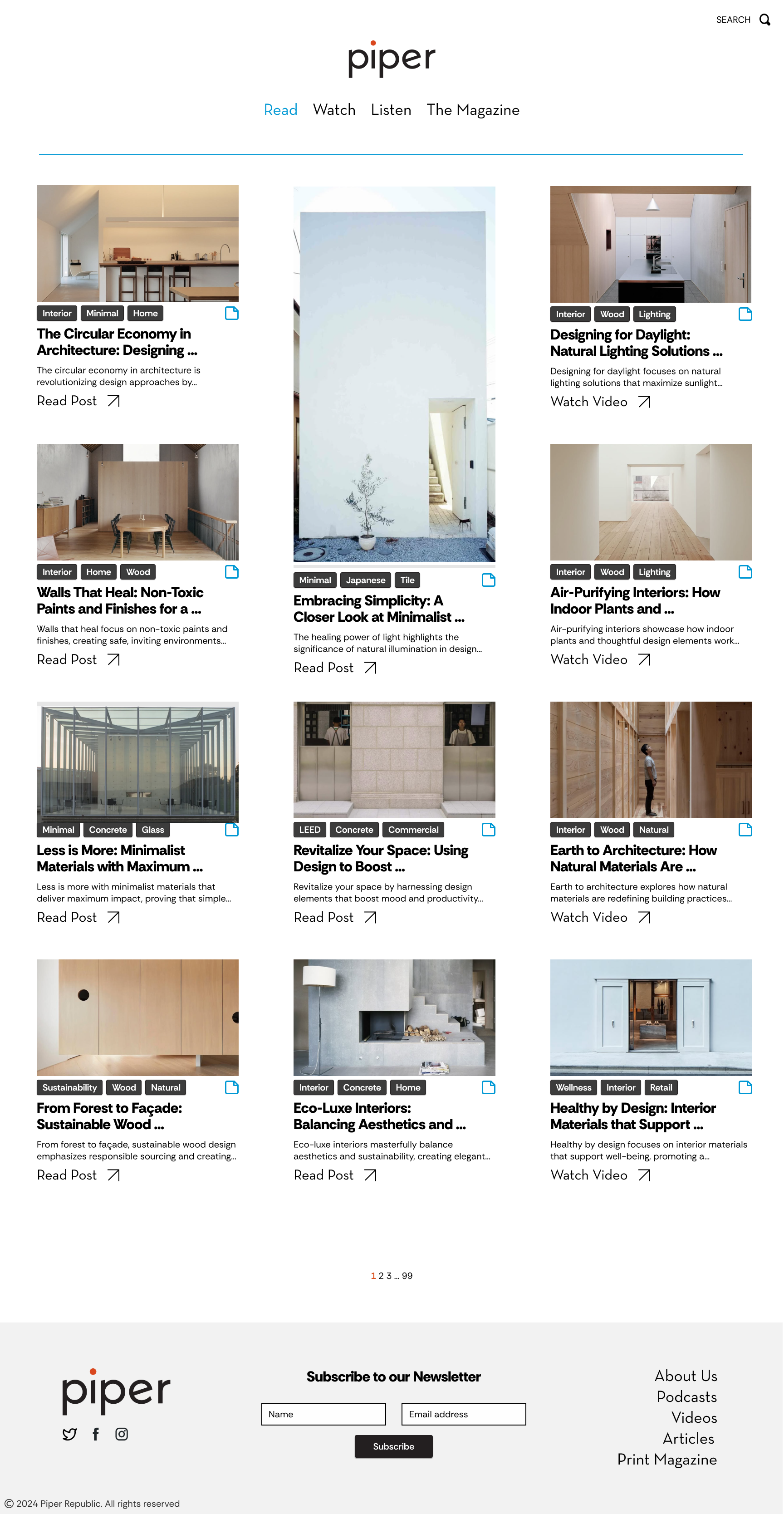
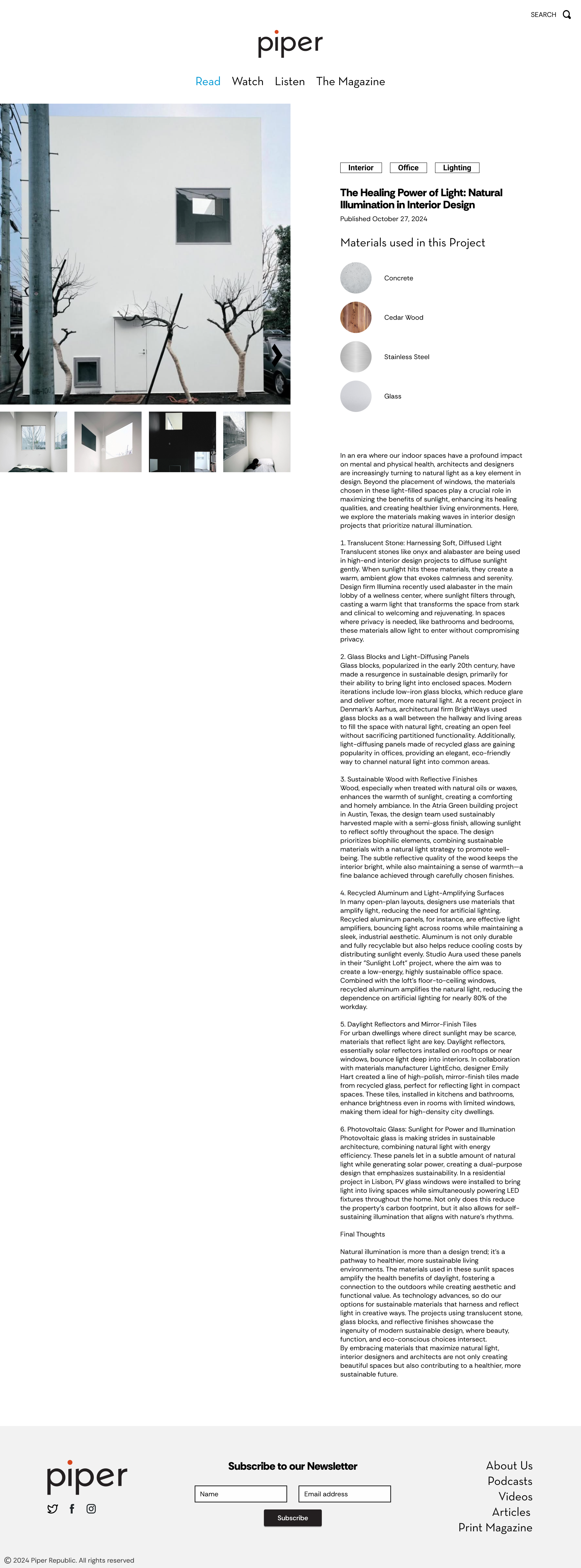
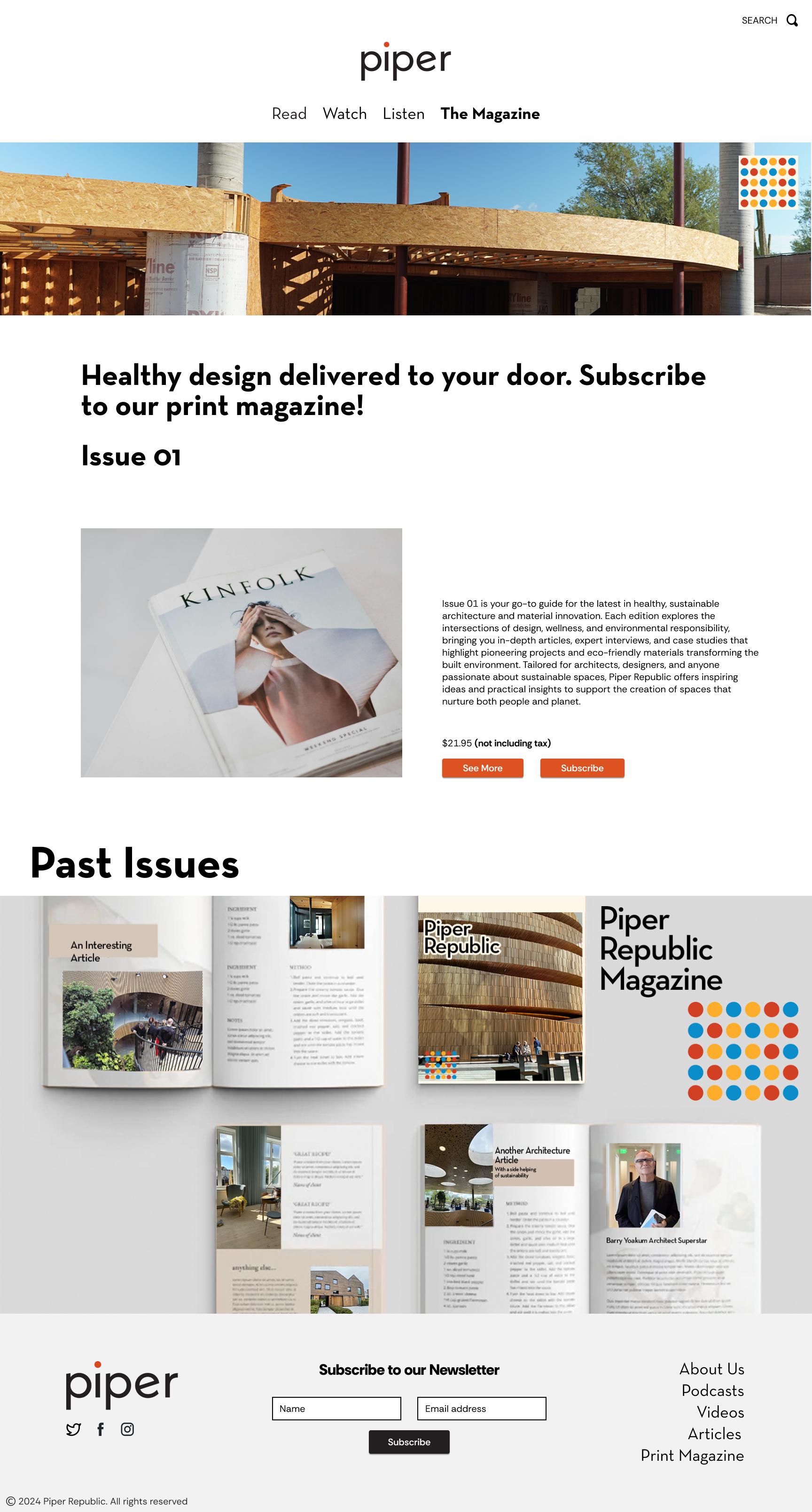
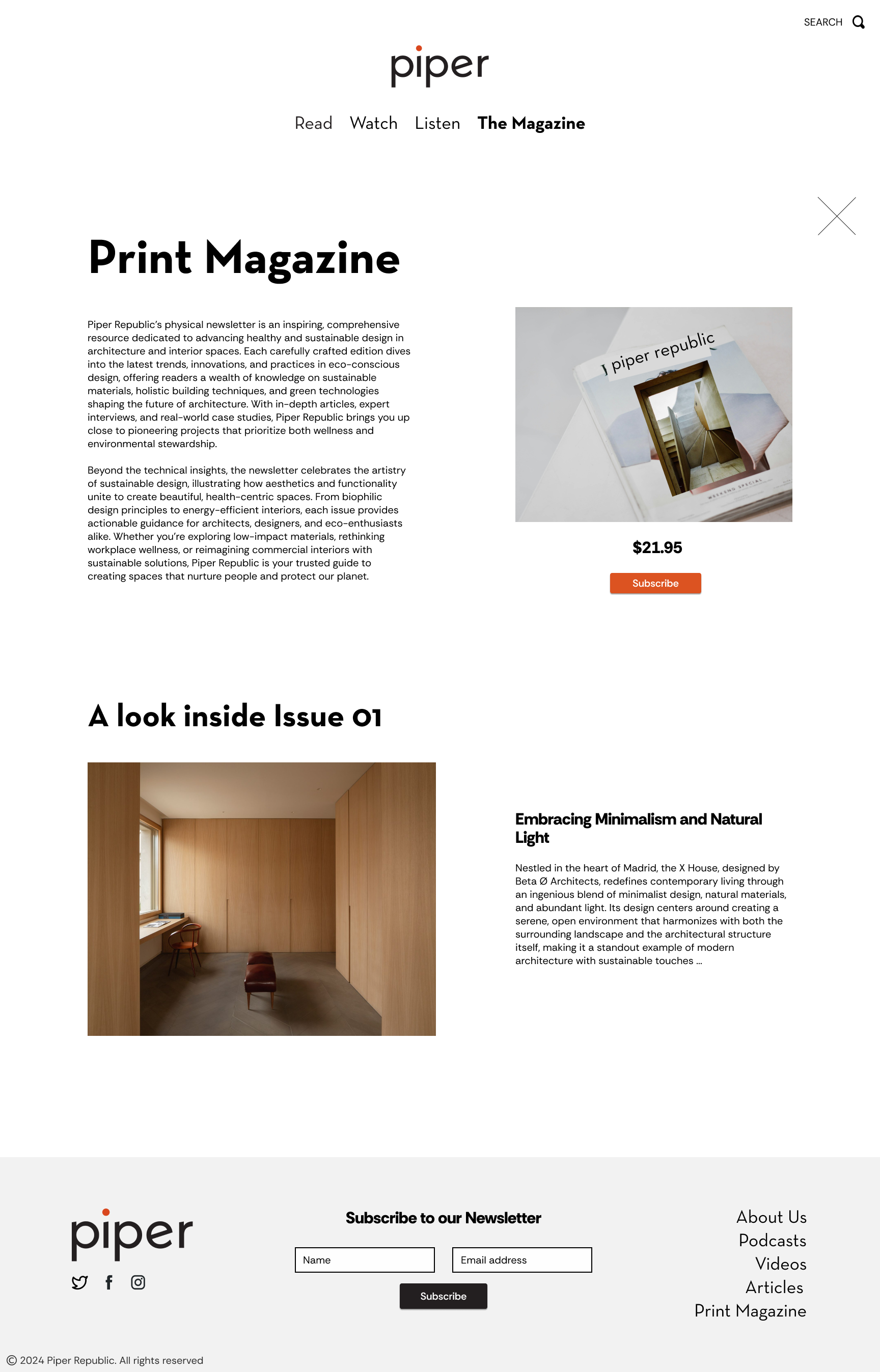
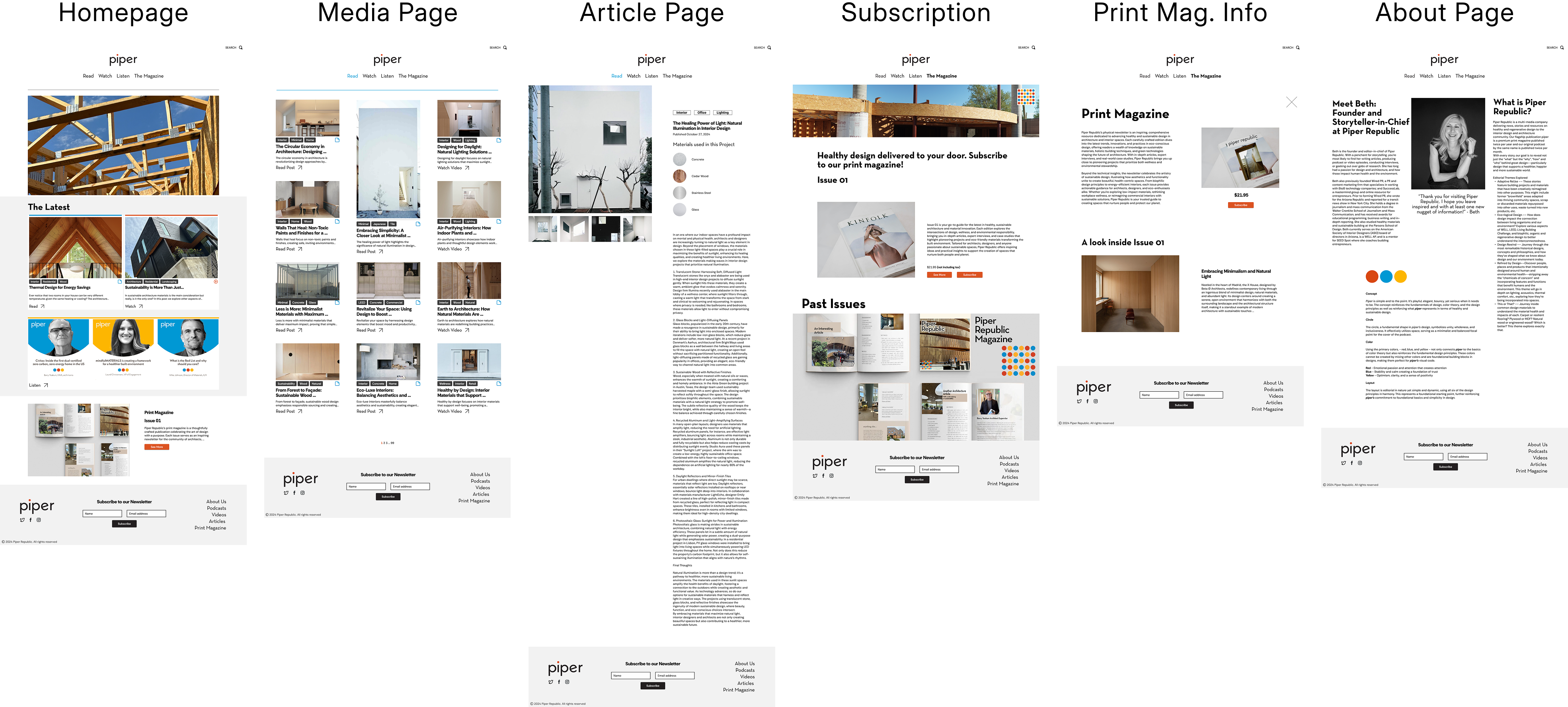
Final Wireframes
Research + Ideation
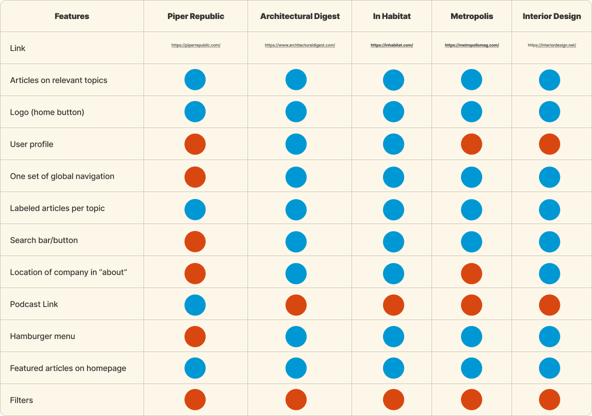
Learning from Leaders of the Industry / Competitive Analysis
Empathizing with Users / Affinity Mapping
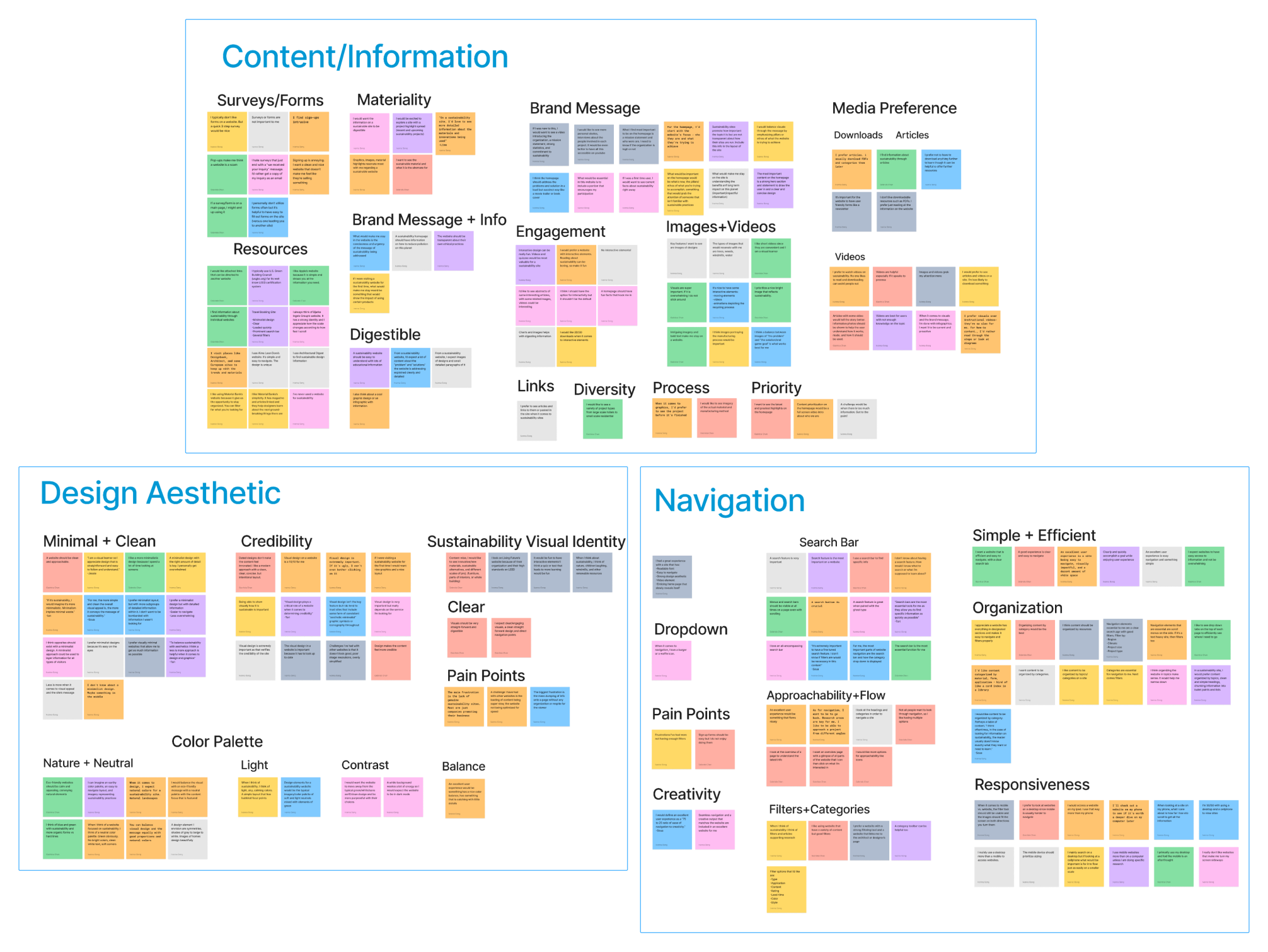
We Learned that Users Want...
Content and Information
- To see the brand’s message present on the site
- Videos and images to accompany contentInformation must be digestible
- No lengthy sign up forms
Design Aesthetic
- A site that is minimal and clean with a lot of information that is visually pleasing
- A color palette inspired by natural elements with neutral tones
- A “credible” website visual design impacts credibility
Navigation
- A search bar to find specific information
- Information organized by category
- Simple and efficient navigation
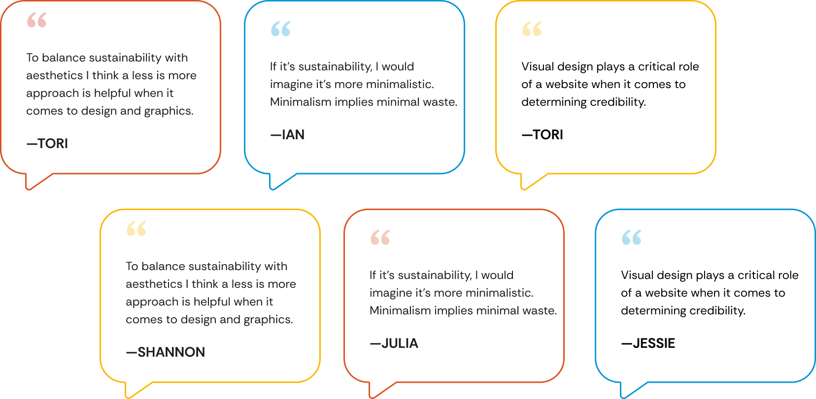
What Users are Saying
Defining the Objective

Design Process
Ideation / Initial Sketches
Mid Fidelity Wireframes
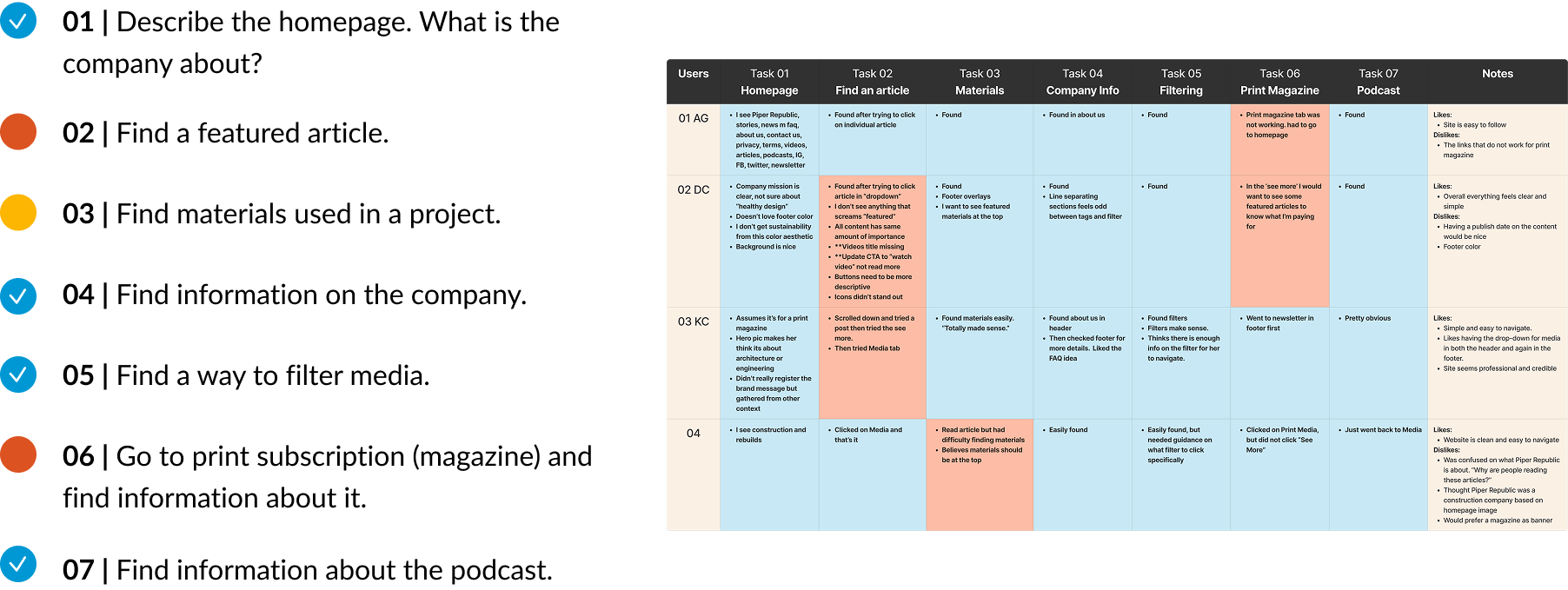
Analyzing the Experience / Task Analysis
We talked to 4 people who regularly use media websites and focused on testing navigation. Users were able to understand what Piper Republic was about but had some issues when looking for specific information.
Task Analysis Insights
Validating Updated Wireframes / Task Analysis
Final Wireframes
Retrospective
This project redefined the brand’s visual identity, improved usability, and aligned it with its sustainability mission. Despite challenges like tight timelines and complex content migration, we delivered a cohesive design system, enhanced navigation, and improved discoverability—driven by user research and agile planning. Future steps include adding personalization, boosting community engagement, and conducting regular brand audits.